Masculine, Serious, Oil and Gas Logo Design for a Company in United States | Design 35238453

Design Tags
Masculine, Oil and Gas Logo Design
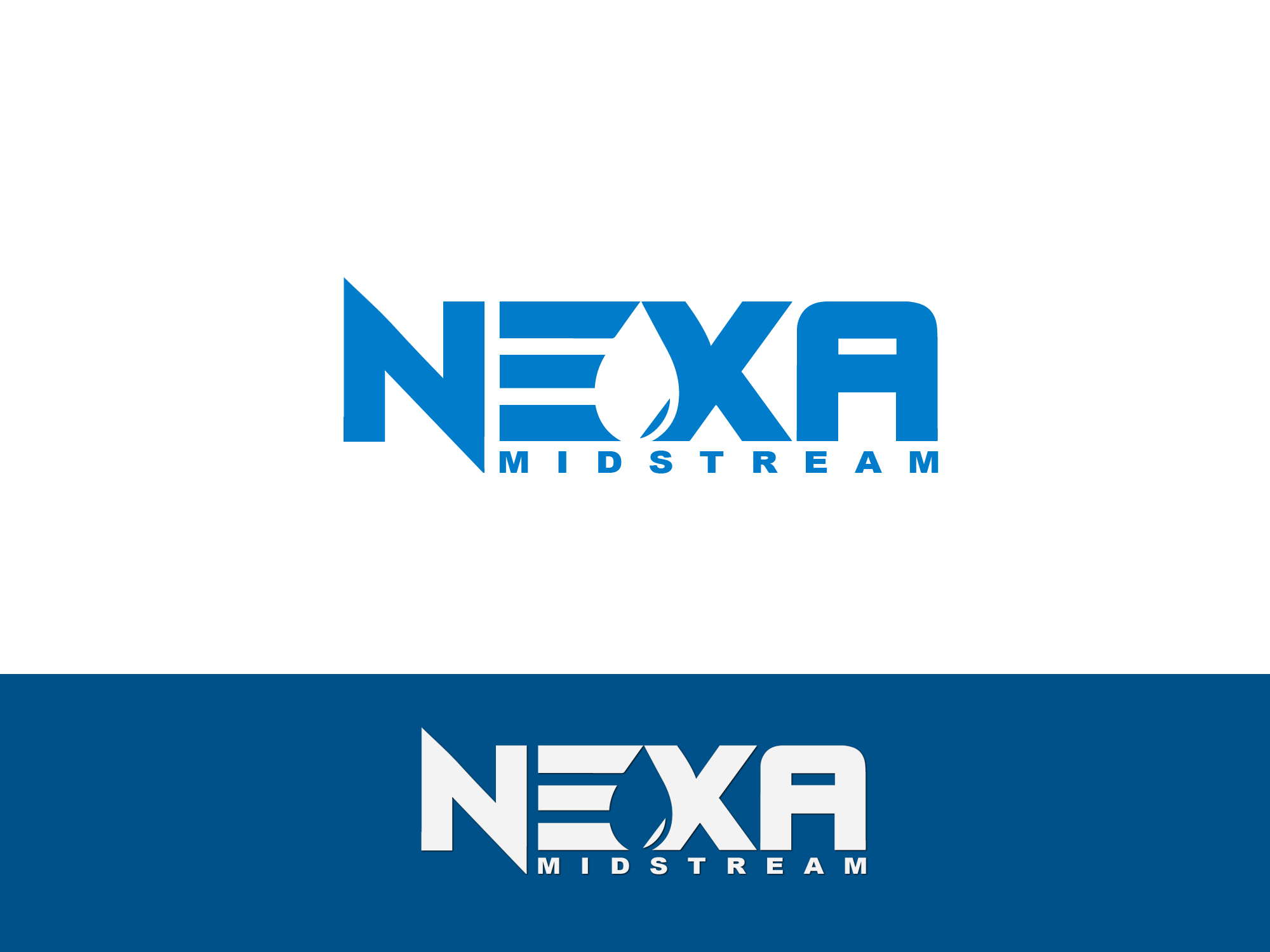
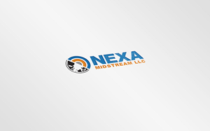
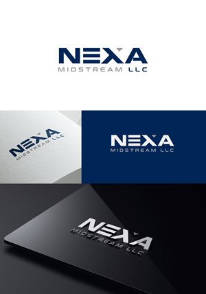
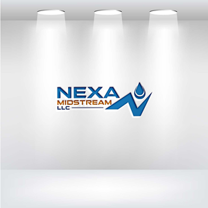
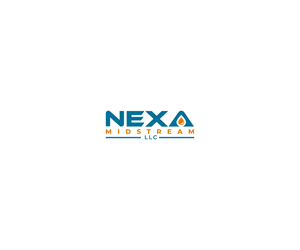
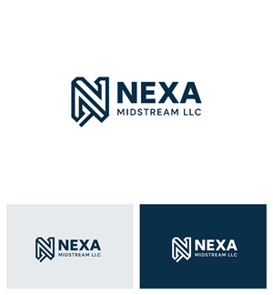
nouarbiti, a Moroccan designer, created this Serious, Oil and Gas logo on 3rd May, 2025 for The logo for Nexa Midstream LLC is a clean, modern visual identity that reflects the company’s strength and professionalism in the oil and gas trading sector. At its core, the design features the word “NEXA” in bold, capitalized, geometric typeface. The font choice conveys industrial strength, stability, and forward-thinking—key qualities for a midstream energy company involved in transporting, storing, and trading oil and gas products. The color scheme is centered on a deep, professional blue. Blue is a color traditionally associated with trust, integrity, and efficiency, making it highly appropriate for a company operating in the high-stakes energy industry. It also subtly references the global nature of energy trading, as blue is often used to represent both the sky and ocean—key elements in international logistics and energy movement. Unlike many logos in the sector, this design avoids generic icons like oil drops or flames, choosing instead a minimalist and text-forward composition. This decision signals Nexa Midstream’s confidence in its brand name and positions it as a modern, agile company rather than a legacy operator. The simplicity of the design also ensures excellent scalability, readability, and versatility across all media—from signage and business cards to websites and tanker decals. The subtitle “MIDSTREAM LLC” is rendered in a lighter, narrow sans-serif font beneath the main name, providing balance and structure without competing for attention. Its placement reinforces the company's specialization in the midstream segment of the energy value chain while maintaining a corporate and clean look. Overall, the logo blends modern design sensibility with industrial relevance. It reflects Nexa Midstream’s mission to deliver reliable, efficient, and innovative oil and gas solutions while maintaining a strong, trustworthy presence in the marketplace. The design is built to endure, just like the infrastructure it represents., a business in United States. The Wordmark logo was designed using a Serif font style for the project 'Nexa Midstream LLC logo contest'.
More Logo Designs from 'Nexa Midstream LLC logo contest'


Get a better logo design for less
Use DesignCrowd's creative community to get your perfect logo at a price that fits your budget.
Launch your project
Tell us what you need, complete your creative brief in a matter of minutes.
Get custom designs
Receive unique logo designs from around the world within hours.
Choose the best logo
Select and approve your favorite design and download the files.
Trusted by 100,000+ businesses
-
“By using DesignCrowd we have saved at least 50% compared to our normal creative agencies. Crowdsourcing is a brilliant way to pick the creative brains of a global design team.”
-
“DesignCrowd changes the game for getting creative work done. You get access to an army of designers who are great at what they do. My personal opinion? Its a great service and I highly recommend it. ”
-
“This was an awesome experience! I look forward to working with DesignCrowd again. It gives you the opportunity to receive ideas from fabulous designers all over the world. I love the outcome!”