CUPCAKES AND SHHHT LOGO DESIGN PIE LIKE SHAPE, FUN, EDGY, TRENDY
Want to win a job like this?
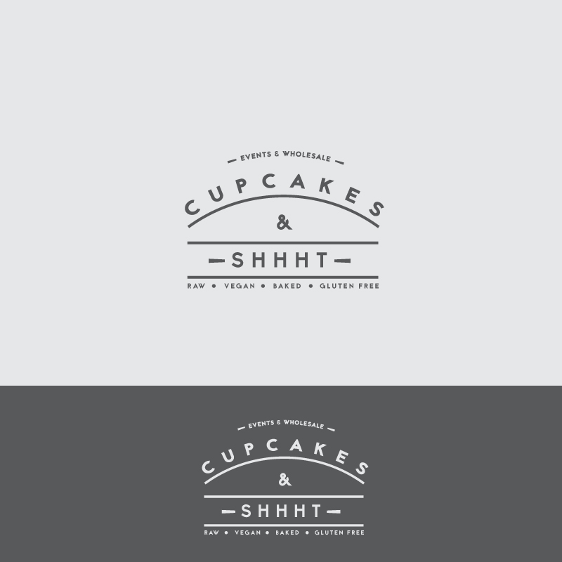
This customer received 79 logo designs from 24 designers. They chose this logo design from NirmalCreation as the winning design.
Join for free Find Design Jobs-
 £120
£120
-
 79 designs
-
 24 designers
Logo Design Brief
We are a small bakery set up in Londons Camden market. We're a bit edgy and fun. We want something that has no assosiation with cupcakes whatsoever. I have attached a pie logo design that we love, we'd like something like this but obviously a digital design. We like plain black and white and also like simple pastel colours and if you see fit to use them, please do so sparingly. I have attached some other logos just so you can get a feel of our font style preferences. Thanks so much.
Updates
Project Deadline Extended Reason: We are so disparate for a new logo design. Please help us! Added Tuesday, March 3, 2015
Target Market(s)
Artists, Foodies, Bakers, Designers, Bloggers, Cafes, Retail, Students
Industry/Entity Type
Digital
Logo Text
Cupcakes & Shhht Events & Wholesale Raw, Vegan, baked, Gluten Free @CupcakesnShhht Facebook.com/cupcakesandshhht
Logo styles of interest
Emblem Logo
Logo enclosed in a shape
Font styles to use
Other font styles liked:
- In attachments
Look and feel
Each slider illustrates characteristics of the customer's brand and the style your logo design should communicate.
Elegant
Bold
Playful
Serious
Traditional
Modern
Personable
Professional
Feminine
Masculine
Colorful
Conservative
Economical
Upmarket
Requirements
Must have
- Pie shape crust outline (circle), Black and a White, Minimal pastel colours (Orange, blue) Cool calligraphy. Keep writing in the circle. Look at photos attached.
Nice to have
- Round outline (Pie like)
- Simple
- Easy to read
- Happy, edgy vibe
Should not have
- Loads of colour
- Boring
- Common fonts
- Too messy
- Over detailed
- Bright colours