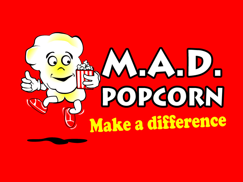
M.A.D. Popcorn

Want to win a job like this?
This customer received 87 logo designs from 14 designers. They chose this logo design from Jozbel as the winning design.
Join for free Find Design JobsLogo Design Brief
The business is simply involved in the manufacture of popcorn. The point of difference to other manufacturers is that we do the popping in front of the customer, so the product is as fresh (and warm) as possible. Our name is M.A.D. Popcorn (Make A Difference Popcorn). The business gives a certain % of every bag sold to local charity. We encourage the customer to place a token (given to them when they buy a fresh bag) into one of 3 containers each of which represents a different local charity. We then convert the tokens to $ which is given to the nominated charity.
Our thoughts in relation to the logo are along the following lines:
• Make it fun (after all it is called MAD Popcorn!)
• Make it kid friendly (we would also like to use the logo on helium balloons to be given away with the bag of popcorn – great advertising!)
• Make it simple, memorable & easily recognisable / describable
• Make it scalable (it will be used on small stickers to be placed on the bags which will describe the contents and it will be emblazoned on the marquee)
• We were thinking of potentially a popped popcorn kernel in the style of one of the M&M characters with one hand on a cup of popcorn & the other placing a token in a charity tin?
Possibly even substitute the logo in place of one of the 'O 's in the word Popcorn...?
Hope the above helps!
Updates
Hi Everyone
Please could you use a 'popped' kernal as the starting point for the character. That way kids will easily be able to relate it to popcorn. Thanks :)
Added Wednesday, March 13, 2013
Hi All
Please could you keep to the following colours only: red, yellow, white, black.
Thanks again!
Added Wednesday, March 13, 2013
Project Deadline Extended
Reason: Straw polling friends, colleagues & relatives. No doubt a couple of minor tweaks may be required. Decision will be made early this week. Thanks for your patience!
Added Monday, March 18, 2013
Hi All
Thank you so much for your designs submitted to date! We have now completed the straw poll and the overwhelming response has been to remove the coin & donation box. The reasons are that a. people will not be coming to make a donation (thats our part!) but simply to buy good popcorn & b. it makes the logo to complex (simplicity is best). So can we ask for the designs to be resubmitted excluding the coin & charity box?
Thanks again & we look forward to your replies and to making a final decision this week.
Regards
Added Monday, March 18, 2013
Hi Everyone
Thank you so much for all your efforts to date. This has been quite a process and we appreciate your patience. We have now chosen a design and thank you all once again.
God Bless
Added Wednesday, March 20, 2013
Target Market(s)
Kids, Mums, Young Adults (think MacDonalds customers)
Industry/Entity Type
Charity
Logo Text
M.A.D.Popcorn. Make A Difference.
Logo styles of interest
Character Logo
Logo with illustration or character
Look and feel
Each slider illustrates characteristics of the customer's brand and the style your logo design should communicate.
Elegant
Bold
Playful
Serious
Traditional
Modern
Personable
Professional
Feminine
Masculine
Colorful
Conservative
Economical
Upmarket
Requirements
Must have
- Kid Friendly (make them laugh!), Scalable (will be used on product stickers and blown up to several meters), simplicity.
Colours: Red, White, Yellow, Black. No other colours please!
Should not have
- Complexity (boooooo....)