Viagem sem erro
Want to win a job like this?
This customer received 12 web designs from 6 designers. They chose this web design from TechWise as the winning design.
Join for free Find Design Jobs- Guaranteed
-
 US$500
-
 12 designs
-
 6 designers
Web Design Brief
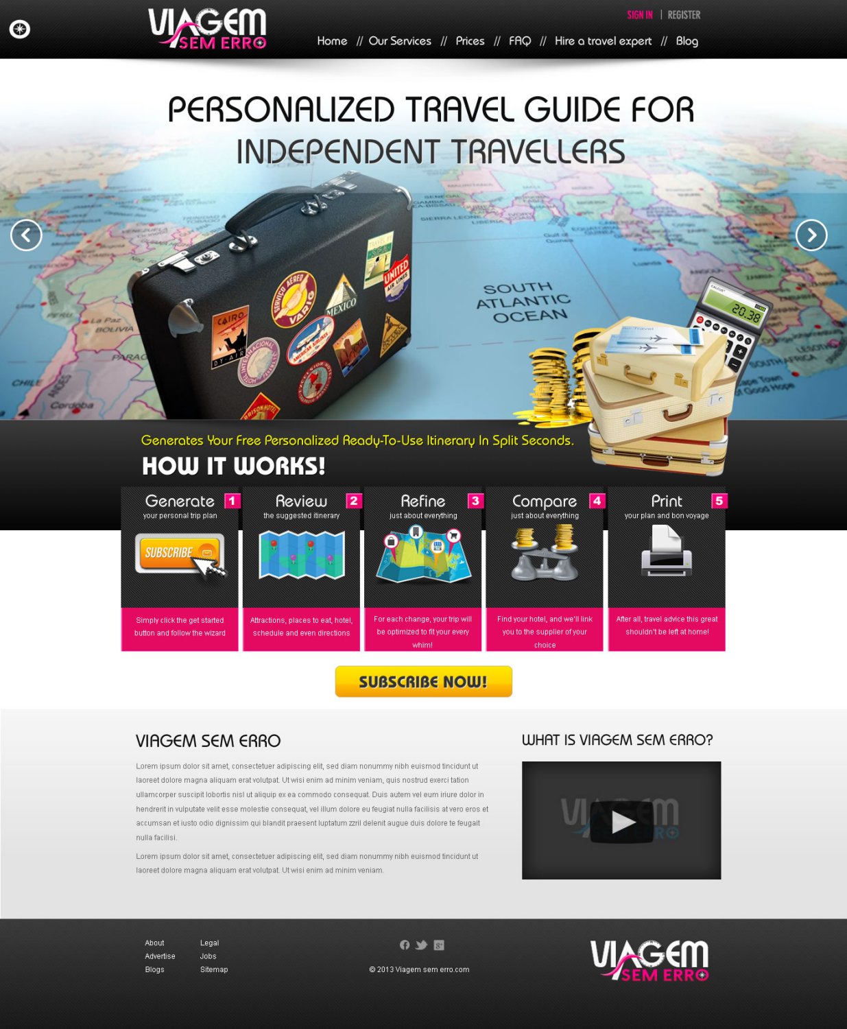
We need a web design for a new company based in João Pessoa, Brazil, called Viagem Sem Erro (Flawless Trip). After the client/consumer fullfill a questionary about the wanted destination, personal interests and available budget for the trip, we aim to plan a personalized travel guide for that independent travellers, containing informations about the places we suggest them to visit, amount of days indicated in each city, possibles restaurants and hotels. The site will help people to manage their budgets and optimize the time at their travel at a low cost and in a simple way. We would like to see clean and sophisticated design that use colors in shades of black, grey and white (and perhaps a touch of pink - what do you think?). The final design should communicate safety, professionalism and experience.
Updates
Project Deadline Extended
Added Saturday, April 20, 2013
Project Deadline Extended
Added Sunday, April 28, 2013
Project Deadline Extended
Added Monday, May 13, 2013
Target Market(s)
People who dont like to buy excursion packages but think they could need a consultance in planning their trip
Industry/Entity Type
It Company
Look and feel
Each slider illustrates characteristics of the customer's brand and the style your logo design should communicate.
Elegant
Bold
Playful
Serious
Traditional
Modern
Personable
Professional
Feminine
Masculine
Colorful
Conservative
Economical
Upmarket
Requirements
Must have
- The menu shall indicate the following points (that will lead to new pages):
1-Our Services
2-Prices
2- FAQ
3-Hire a travel expert to plan your trip!
4-Around the world - blog
Fell free to put the logo of the site "Viagem Sem Erro" in the top middle/top left/ or wherever you find it is more appropriate.
On the top right we should put a login/register button.
Above that menu, I thought about illustrating with a figure demonstrating how it works - step by step, as seen in the link http://plnnr.com/ - but in a more clean design.
Nice to have
- Pay pal will be used as the payment option.