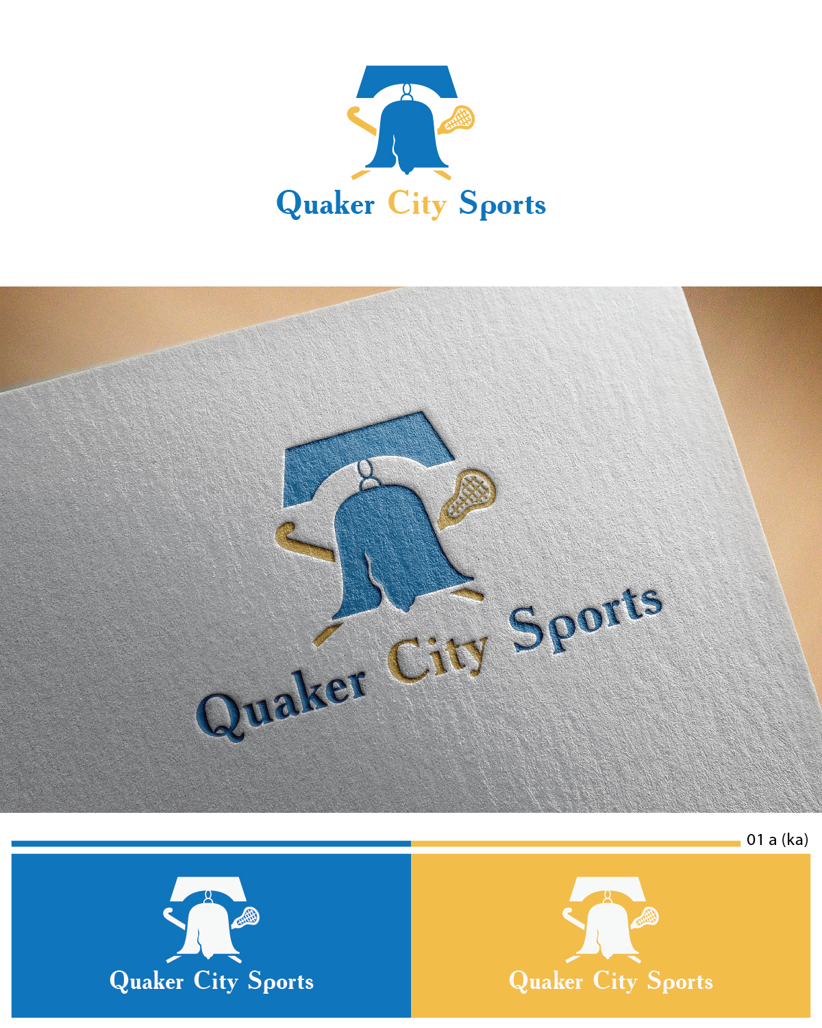
Logo design for Quaker City Sports (field hockey and lacrosse programs for youth)
Winner
Want to win a job like this?
This customer received 30 logo designs from 10 designers. They chose this logo design from Esolbiz as the winning design.
Join for free Find Design Jobs-
 US$160
-
 30 designs
-
 10 designers
Logo Design Brief
We need to combine the look of two separate organizations’ logos into one logo. We will get rid of the name Filia and go with "Quaker City Sports" but we like the look and feel of Filia. We do like the liberty bell on Quaker City (we are in Phildelphia, PA). Lastly, Quaker City Sports will be both field hockey and lacrosse so we want both sports to be captured in the logo. See current logos in attachment.
Target Market(s)
Parents and kids ages 6-16
Logo Text
Quaker City Sports
Look and feel
Each slider illustrates characteristics of the customer's brand and the style your logo design should communicate.
Elegant
Bold
Playful
Serious
Traditional
Modern
Personable
Professional
Feminine
Masculine
Colorful
Conservative
Economical
Upmarket
Files
Download all files - 0.1 MBPNG
filia_logo_v1b Monday, 11 May 2015 18:50:06
Thursday, May 14, 2015
JPG
10579987_721267277920869_2312990840944585058_n Monday, 11 May 2015 18:50:26
Thursday, May 14, 2015
Payments
1st place
US$160