Logo design for company selling videogame/geek merchandise
Want to win a job like this?
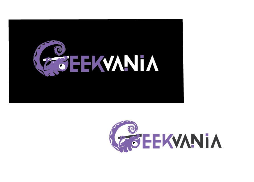
This customer received 76 logo designs from 35 designers. They chose this logo design from Claris as the winning design.
Join for free Find Design Jobs- Guaranteed
-
 £145
£145
-
 76 designs
-
 35 designers
Logo Design Brief
The logo is for "GeekVania", which will sell, manufacture, and ship officially licensed merchandise from within the video game genre, as well as other 'geek' interests. It will primarily be t-shirts and hoodies, but isn't limited to just garments as there will also be other forms of merchandise so the logo shouldn't restrict the company to being a t-shirt brand.
We'd like it to be corporate enough to be taken seriously, but not boring or bland. It should have an element of quirkiness to it, but avoid focusing on the 'Vania' side and going for anything related to the horror genre. The logo also doesn't need to have the uppercase G and V, so if it looks odd then don't force it but just it would be preferred that there's at least a little differentiation between the two words using either a different colour for each or different font weight, although it's also not necessary.
No colours have been decided as we'd rather be inspired by whatever you come up with. Better to work on the website design around a great logo than force a logo into an existing website.
Target Market(s)
Probably 18-35 year old males, based on the typical gamer demographic, but we'd rather that the logo didn't pigeon-hole people.
Industry/Entity Type
It Company
Logo Text
GeekVania, which can also be stylised as Geekvania or geekvania
Logo styles of interest
Abstract Logo
Conceptual / symbolic (optional text)
Wordmark Logo
Word or name based logo (text only)
Font styles to use
Look and feel
Each slider illustrates characteristics of the customer's brand and the style your logo design should communicate.
Elegant
Bold
Playful
Serious
Traditional
Modern
Personable
Professional
Feminine
Masculine
Colorful
Conservative
Economical
Upmarket
Requirements
Nice to have
- Would be nice to have a recognisable standalone emblem to go along with the text so that it could be used on its own and still have it known who was being represented. Would also prefer that the logo be considerably longer than it is tall, so that it will fit better as a store header rather than a stacked logo which would take up very little horizontal space.
- Difficult to explain, but the dimensions of the 'DesignCrowd' logo would suit us better than those of this adidas logo: http://upload.wikimedia.org/wikipedia/commons/thumb/2/20/Adidas_Logo.svg/1280px-Adidas_Logo.svg.png
Should not have
- Papyrus. Seriously. That typeface should be destroyed.