Knightsbridge osteopathy leaflet with a high quality feel for affluent clients
Want to win a job like this?
This customer received 20 flyer designs from 5 designers. They chose this flyer design from patestevao as the winning design.
Join for free Find Design Jobs-
 £95
£95
-
 20 designs
-
 5 designers
Flyer Design Brief
Design a quality flyer for an osteopathy clinic in Knightsbridge.
It must be eye catching, stylish and informative.
To explain the attached documents;
The file’ George Vallossian Leaflet.pdf’ is approximately what I want, look wise, but with a designer's eye over it - to me this is too amateur.
Logo and background image as well, although I have others if you feel it is not right.
The 'tree logo' is the logo I use for my Richmond clinic; if there is a way to utilise it here then I'm open to it.
Company background;
I am an osteopath hiring a room from an existing business (a hairdresser’s), so I want to capitalise on his success and local name but also make it clear from this leaflet that osteopathy is the focus.
On the back of the flyer, the following copy;
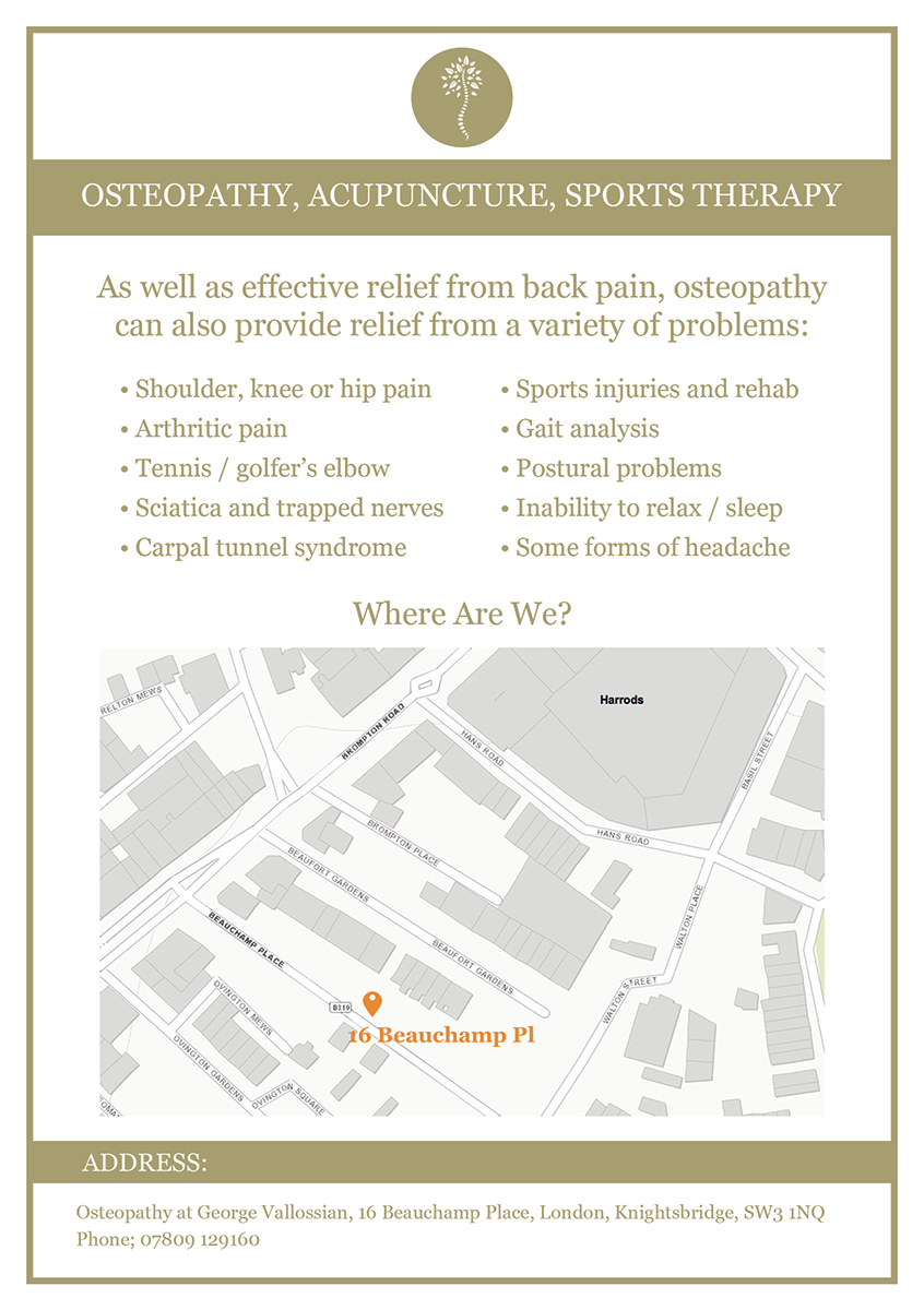
Osteopathy, acupuncture, sports therapy
As well as effective relief from back pain, osteopathy can also provide relief from a variety of problems;
• Shoulder, knee or hip pain
• Arthritic pain
• Tennis / golfer’s elbow
• Sciatica and trapped nerves
• Carpal tunnel syndrome
• Sports injuries and rehab
• Gait analysis
• Postural problems
• Inability to relax / sleep
• Some forms of headache
Address;
Osteopathy at George Vallossian, 16 Beauchamp Place, London, Knightsbridge, SW3 1NQ
Phone; 07809 129160
Target Market(s)
people with back or other pain - sporty, affluent people
Industry/Entity Type
Clinic
Font styles to use
Look and feel
Each slider illustrates characteristics of the customer's brand and the style your logo design should communicate.
Elegant
Bold
Playful
Serious
Traditional
Modern
Personable
Professional
Feminine
Masculine
Colorful
Conservative
Economical
Upmarket
Requirements
Must have
- eye catching, quality,
Nice to have
- map and directions
- information about osteopathy on the back
Should not have
- a low value feel