Energy Supplement Company Needs Packaging Design! See Your Design In Stores Everywhere!
Want to win a job like this?
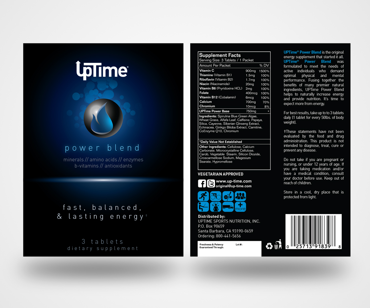
This customer received 88 packaging designs from 30 designers. They chose this packaging design from Christopher Miller as the winning design.
Join for free Find Design Jobs- Guaranteed
-
 US$700
-
 88 designs
-
 30 designers
Packaging Design Brief
Have you ever dreamed of seeing your designs on store shelves, billboards and in the hands of celebrities and professional athletes?
Well, your dreams may just come true… You now have the chance to have your design on the product packaging of the next major energy supplement company!
UPTIME Energy, Inc. is inviting the most creative, ambitious and talented designers to create a new look and feel for our brand's most popular products, the UPTIME Energy Tablets.
UPTIME Energy, Inc. began in 1985 by creating the original energy tablet, most recognized for its iconic blue packet featured in over 20,000 retail stores today. The company grew through their grass roots philosophy of distribution and quickly expanded across the United States through dozens of regional and national chains like 7-11, Circle K and GNC. In February of 2001, the founder of UPTime passed and the company’s grass roots approach lost momentum and distribution as the fierce competition from energy shots and drinks hit the space that they once owned.
Benjamin Kim, a 26 year user of UPTIME tablets, noticed that his favorite daily energy product was becoming increasingly more difficult to find in stores. As an active, serial entrepreneur with numerous ventures, his deep passion for UPTIME led him to explore the opportunity to get involved with the company (get involved is an understatement). On August 1st of 2012, Ben raised capital and bought the company.
To increase awareness and spread his passion for UPTIME, Mr. Kim organized and structured the new UPTIME Energy, Inc. by bringing on a talented Team and investors, including Bill Duffy, a renowned sports agent/owner of the largest basketball agency whose clients include some of the biggest names in the sport. The amazing quality of our products coupled with the loyal following from the masses has led the brand to new heights and sponsorship opportunities with major sports teams and athletic organizations.
Now that the future is looking UP, we are looking for a brand refresh to bring our tablets current.
Your mission -should you chose to accept- is to develop a new graphic design for our energy tablet packets. We expect the graphic design to be modern, sleek and appealing to an 18-34 demographic. This new design will serve as the vehicle to spark excitement about energy tablets and their superiority over other forms of energy supplements. However, most importantly, you must make the package eye catching yet trusting and approachable. Keep in mind that this is something you would see in a retail store and feel comfortable reaching for and trying.
It is important to stress the mainstream direction of our company. The current packaging is somewhat 'dated' and may be out of touch with mainstream interests. Just like your aunt still rocking shoulder pads and leg warmers, we need to leave the 1980s and join everyone in 2013. Although we will begin positioning our brand towards mainstream sports, our goal is to have our products everywhere from the sidelines of major sporting events to board meetings of fortune 500 companies to the backpacks of college students. Therefore, the winning design will be one that transcends the interests of a specific group and appeals to the broader audience. Remember this is something you could see Kobe Bryant, Bill Gates, and your mother holding.
Here's the great part: We are leaving all of the designing up to you!
You can redesign everything and anything you want (change colors, company logo design, content, etc.). Think of it as a blank canvas.
If you have any questions regarding design or UPTIME Energy, Inc. in general, please feel free to email us at design@up-time.com or check out our website at www.up-time.com.
Good luck!
Updates
To start, we'll better explain what we want to see in the designs.
Although we are an energy company, we are looking to be very contemporary and sleek. Our current brand and packaging is bright and colorful, but that doesn't necessarily fit with the repositioning of our brand as a mainstream energy brand. Designs should try to only include a few colors at most. Each tablet packet should look great one their own and amazing together.
Moreover, the designs should be relatively minimalistic. We aren't looking for anything to be "in your face". We need to reintroduce to the 18-34 generation that taking energy tablets are safe, effective, and a superior way of consuming energy supplements. Therefore, an approachable packet design is imperative. Neon colors, electricity, etc. only makes the product look scary and intimidating.
To sum up:
Ø Use only a few colors
Ø Target an 18-34 year old demographic
Ø Minimalistic/approachable design
Ø Move away from Retro look with bright colors
FAQs:
1) We have been asked about whether or not you should be redesigning the logo on the packaging also. The answer is YES. We want every part of the packets updated. You are also designing 3 different packets or our whole energy tablet line (Power Blend, Maximum Blend, and Herbal Blend).
2) The packets have a height of 4'' and a width of 3''. They are double-sided, so if you have a creative way of designing the back panel with the supplement facts, we would love to see it.
We want all of you to know that we appreciate all of your hard work on creating these designs and helping to rebrand our company. Again, if you have any questions at all, the best way to reach us is by emailing us at design@up-time.com.
THANK YOU!!
The UPTIME Design Team
Added Sunday, April 14, 2013
Project Deadline Extended
Reason: We are extending the deadline for designs until Friday April 26th. We hope this will give designers a chance to submit final designs for the competition.
As always, please feel free to email us directly at design@up-time.com if you have any questions.
Added Saturday, April 20, 2013
Hi everyone!
Added Friday, April 26, 2013
Target Market(s)
18-34 year olds. Active, mainstream audience (not extreme-sports fans)
Industry/Entity Type
Graphic Design
Look and feel
Each slider illustrates characteristics of the customer's brand and the style your logo design should communicate.
Elegant
Bold
Playful
Serious
Traditional
Modern
Personable
Professional
Feminine
Masculine
Colorful
Conservative
Economical
Upmarket
Requirements
Must have
- Product packet is 4''x3''
Should not have
- -Pictures of sports equipment.
-Resemble other energy products
-Look scary or intimidating
-Should not look like a cartoon or animation
-No neon colors