OSS Project Re-branding - Logo Revamp (Oil & Gas Sector)
Want to win a job like this?
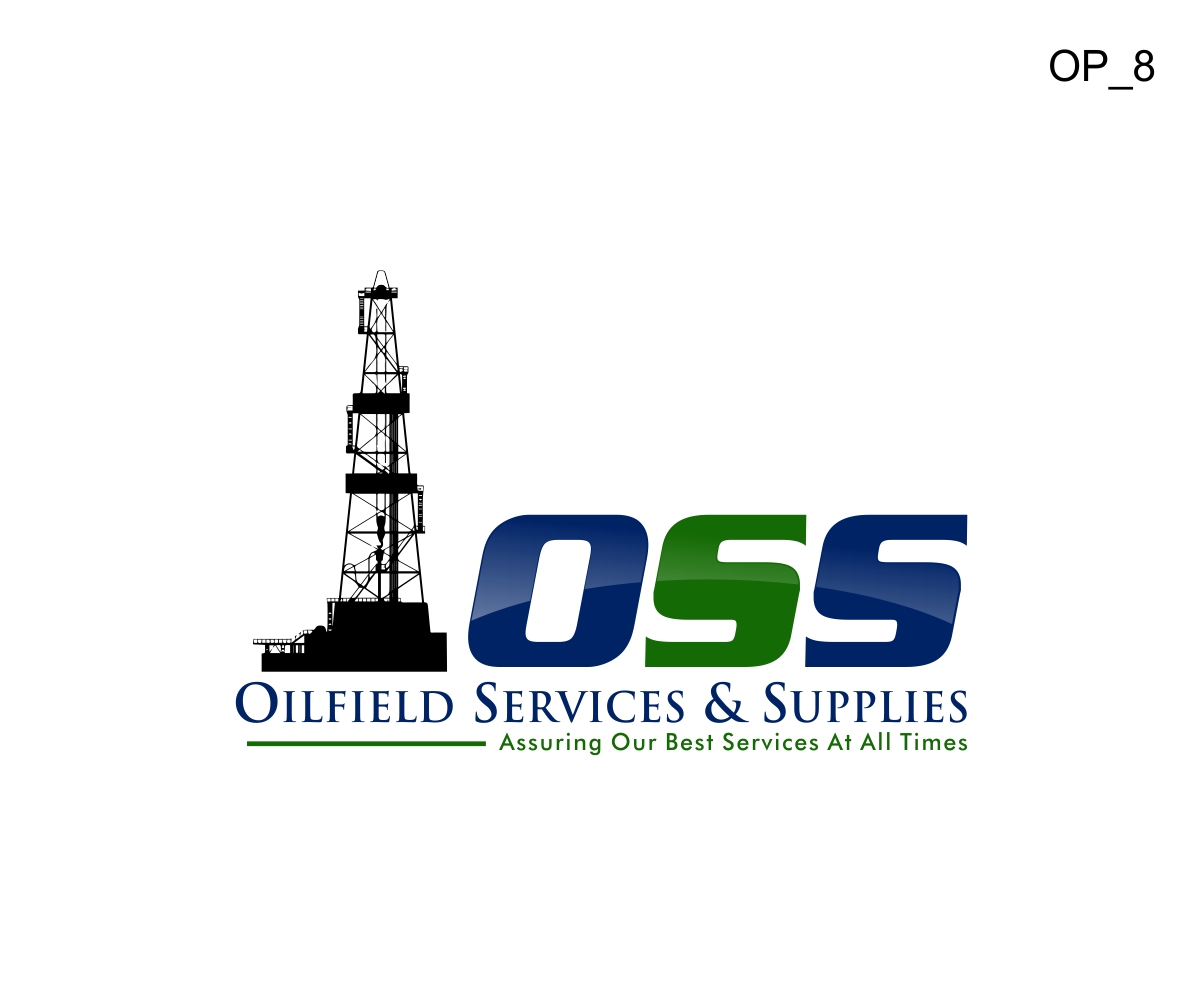
This customer received 75 logo designs from 17 designers. They chose this logo design from Liyana as the winning design.
Join for free Find Design Jobs-
 S$200
S$200
-
 75 designs
-
 17 designers
Logo Design Brief
We do need designing services to revamp our logo for our company, Oilfield Services & Supplies, as we are undergoing a major overhaul of re-branding ourselves. In short, we are an oil drilling tool manufacturer that supplies oilfield tools to major O&G service companies such as Halliburton, Schlumberger, Baker Hughes and etc. Examples of our core products include stabilizers, drill collars & sub.
Do visit our website at www.ossapi.com for more details on our company and product line.
Attached please find our existing corporate logo for your reference (indicated as signature.jpg) with below-mentioned, a list of requirements that we would like to meet for the new logo,
1. The new logo should bear slight resemblance to the old logo (i.e. visuals, colour scheme and etc.) & not radically different.
2. Instead of using our registered company name - Oilfield Services & Supplies in the logo, we would like to now use the acronym “OSS” as this is how our customers normally address us by.
3. Corporate colors are blue & green with Arena Condensed as our corporate font. We would still like to maintain these as our corporate colors and incorporate them into the logo. On the contrary, do feel free to change the corporate fonts based as per your discretion.
4. Like to retain our slogan, "Assuring Our Best Services At All Times."
5. Only if it aligns with your design scheme, we would like to have the oil rig visual again but have it updated (e.g. similar silhouette, few abstract strokes to depict an oil rig or etc.) as the resolution is of sub-optimal quality. Please find the current rig visual depicted in logo small.png for referencing purposes.
6. We do hope that the logo can be classic, mature, geometric and masculine.
Updates
Project Deadline Extended
Reason: awaiting changes from designer
Added Sunday, July 19, 2015
Project Deadline Extended
Reason: Still fine tuning on the design
Added Friday, July 24, 2015
Project Deadline Extended
Reason: We still have yet finalized the logo.
Added Monday, August 10, 2015
Industry/Entity Type
Oil And Gas
Logo Text
OSS with slogan - Assuring Our Best Services At All Times
Look and feel
Each slider illustrates characteristics of the customer's brand and the style your logo design should communicate.
Elegant
Bold
Playful
Serious
Traditional
Modern
Personable
Professional
Feminine
Masculine
Colorful
Conservative
Economical
Upmarket
Requirements
Must have
- 1. The new logo should bear slight resemblance to the old logo (i.e. visuals, colour scheme and etc.) & not radically different.
- 2. Instead of using our registered company name - Oilfield Services & Supplies in the logo, we would like to now use the acronym “OSS” as this is how our customers normally address us by.
- 3. Corporate colors are blue & green with Arena Condensed as our corporate font. We would still like to maintain these as our corporate colors and incorporate them into the logo. On the contrary, do feel free to change the corporate fonts based as per your discretion.
- 6. We do hope that the logo can be classic, mature, geometric and masculine.
Nice to have
- 4. Like to retain our slogan, "Assuring Our Best Services At All Times."
- 5. Only if it aligns with your design scheme, we would like to have the oil rig visual again but have it updated (e.g. similar silhouette, few abstract strokes to depict an oil rig or etc.) as the resolution is of sub-optimal quality. Please find the current rig visual depicted in logo small.png for referencing purposes.