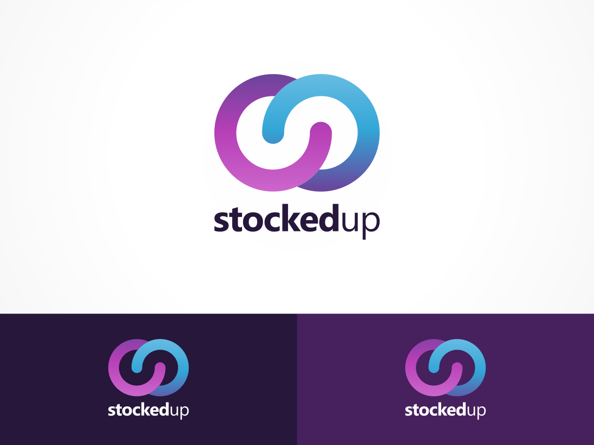
Cloud based application for stock replenishment

Want to win a job like this?
This customer received 34 logo designs from 13 designers. They chose this logo design from Undo as the winning design.
Join for free Find Design JobsLogo Design Brief
Design a logo for the application that represpents the catering trade and stocking their larders, freezers and fridges. The logo needs to be fun but not flipant, modern but not too out there.
The application is a cloud based service that allows users to access the system from anywhere on any device. The application will also become a iPhone/iPad application at some point in the near future so ideally rounded square in overall form.
Updates
Hi this is the last day of the contest, there are a few designers who have stepped up to the plate with great ideas. But as yet there isn't a winner so I would appreciate it if those of you that have positive feedback could have a last look at my comments and see if we can get the perfect design for the application.
Regards
Simon
Added Saturday, July 25, 2015
Project Deadline Extended
Reason: The project needs a few more days to finalise designs!
Added Sunday, July 26, 2015
Target Market(s)
Pubs and Restaurants
Industry/Entity Type
Catering
Logo Text
Stocked Up
Logo styles of interest
Abstract Logo
Conceptual / symbolic (optional text)
Font styles to use
Colors
Colors selected by the customer to be used in the logo design:
Look and feel
Each slider illustrates characteristics of the customer's brand and the style your logo design should communicate.
Elegant
Bold
Playful
Serious
Traditional
Modern
Personable
Professional
Feminine
Masculine
Colorful
Conservative
Economical
Upmarket
Requirements
Must have
- Focus on the aims of the project not the name of the service.
Nice to have
- Humour and some graphical references to what the project is about. Ideally I would like the logo to be abstract and the text can be entirely absent!
Should not have
- The design should not focus soley on the name of the application. The text needs to minimal and subtle and not the main aspect of the logo. Please don't just plonk an upward arrow on the logo and the name. I could do that with photoshop my self.