The Crowd - Collective Intelligence
Want to win a job like this?
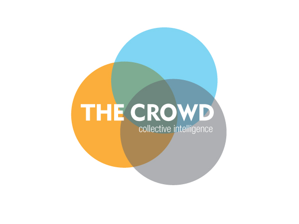
This customer received 348 logo designs from 99 designers. They chose this logo design from jane-designs as the winning design.
Join for free Find Design Jobs- Guaranteed
-
 £640
£640
-
 348 designs
-
 99 designers
Logo Design Brief
Green Mondays (as we are now) is about to become The Crowd... as part of this rebrand we are after an amazing new logo to feature across all aspects of our digital and physical being (including web, social (primarily twitter), event branding, business cards, letterheads etc).
We are looking for a clean, fresh design that will resonate with our primarily senior corporate crowd. Although we are primarily focussed on the sustainability sector (see blurb below) we are actively seeking to engage the mainstream corporate community, so the logo should not feel too 'green'.
Our website will be the main hub for activity, it is in design but will be clean and uncluttered, carrying a combination of UGC and content created by ourselves. (mainly videos/blogs)
The Crowd in Six Sentences...
The Crowd is a media company that is helping business redefine their relationship with society.
History tells us that periods of fast social change are associated with new ways of information sharing - the printing press, the arrival of radio and the internet.
The sharing of information, or 'collective intelligence' is at the heart of everything we do.
Our innovative platforms are designed to harness the power and wisdom of the business community; showcasing ideas , encouraging innovation and driving long-term change to the way we do business.
We believe that collectively business has the power, and responsibility, to respond to the challenges of the future.
The Crowd is here to help them do just that.
Us in words...
Creative, Commercial, Committed, Challenging, Conversational, Collaborative, (A) Community.
Optimistic, Open, Surprising, Friendly, Inspiring, Innovative, Knowledgeable, Ambitious
You can read more about the company at www.greenmondays.com - take a particular look at www.greenmondays.com/sainsburys and our recent Generation Net Positive event and report for an idea of the space we are trying to own. (But please don't take any design inspiration from the site!)
Target Market(s)
Corporate Community, normally quite senior - keen for it to entice wide range of business functions beyond just sustainability
Industry/Entity Type
Sustainability
Logo Text
The Crowd (plus strapline: Collective Intelligence)
Logo styles of interest
Emblem Logo
Logo enclosed in a shape
Pictorial/Combination Logo
A real-world object (optional text)
Abstract Logo
Conceptual / symbolic (optional text)
Character Logo
Logo with illustration or character
Look and feel
Each slider illustrates characteristics of the customer's brand and the style your logo design should communicate.
Elegant
Bold
Playful
Serious
Traditional
Modern
Personable
Professional
Feminine
Masculine
Colorful
Conservative
Economical
Upmarket
Requirements
Must have
- Must have versions with and without the strapline and a version (can be same) that is useable as a twitter image.
It should be clean and simple.
It needs to reflect the 'us in words' bit above and be something that will resonate within the corporate community.
IMPORTANT NOTE: During the process of the previous competition a few more key attributes became apparent - the logo should feel
- Not too masculine
- Open
- Be able to infer energy/change/innovation
Nice to have
- This is a re-run of a previous competition and in that we nailed down that we are fans of blue/turquoise, so consider that.
Our new site will use a colour palette featuring blues with sporadic use of orange as a contrast.
Should not have
- It shouldn't look or feel too green/wildlife/sustainability. Our experience has suggested going too heavy on these too early is a turn-off to those corporates who are not directly involved in sustainability. (And who are key targets for us - e.g. Finance, Marketing, Procurement).
I'd rather not see the colour green included.