Label redesign for supplement brand
Want to win a job like this?
This customer received 7 graphic designs from 3 designers. They chose this graphic design from Nic M Rayce as the winning design.
Join for free Find Design Jobs- Guaranteed
-
 US$130
-
 7 designs
-
 3 designers
Graphic Design Brief
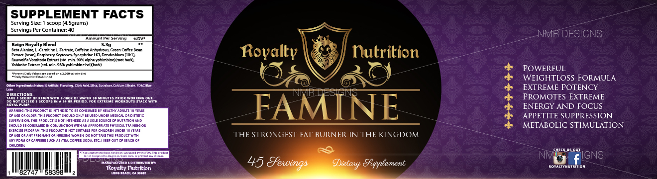
Looking to do a "reign" label redesign to better present our brand to the masses. To look high quality and prestige while maintaining a Royalty feel. To stand out on the shelf and easy to present to consumers. The 'famine " picture is just a reference point so you can see the current style. Looking for a clean, high end look, remaining prestige with the Royalty Nutrition logo and theme. Different textures on the labeling is welcome to cause more depth for the consumer
Updates
Project Deadline Extended Reason: I am looking to have a label re- design for the "reign" product .... Not a logo change and I would also like to maintain the "royalty" theme the company is called Royalty Nutrition. Purple and gold are my main colors now, just looking to be made more marketable and stand out for the consumer in a positive way in the retail enviroment Added Saturday, August 15, 2015
Target Market(s)
18-55 male and female, health and fitness
Industry/Entity Type
Nutrition
Colors
Colors selected by the customer to be used in the logo design:
Look and feel
Each slider illustrates characteristics of the customer's brand and the style your logo design should communicate.
Elegant
Bold
Playful
Serious
Traditional
Modern
Personable
Professional
Feminine
Masculine
Colorful
Conservative
Economical
Upmarket
Requirements
Must have
- Marketable design layout to appeal to the consumers and prefer to stick to purple and gold colors as the main colors for the "royalty" theme