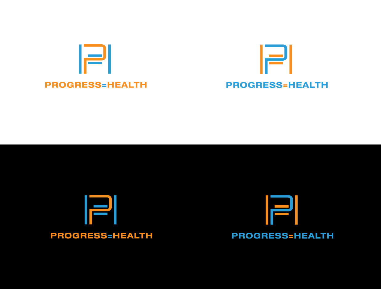
Progress + Health Personal Training logo
Winner
Want to win a job like this?
This customer received 99 logo designs from 41 designers. They chose this logo design from voltgain as the winning design.
Join for free Find Design Jobs- Guaranteed
-
 NZ$200
-
 99 designs
-
 41 designers
Logo Design Brief
Something simple, but elegant. I would like to see versions with and without P=H. Focus on health and fitness, but no logos of the human body.
The logo is for personal training company based in Scotland which is focused on empowering clients to own the knowledge required to help themselves.
Target Market(s)
Health and Fitness Personal Training in Scotland
Industry/Entity Type
Personal Trainer
Logo Text
Progress=Health
Logo styles of interest
Abstract Logo
Conceptual / symbolic (optional text)
Font styles to use
Sans Serif
Colors
Colors selected by the customer to be used in the logo design:
f78f20
e4daeb
85cae6
Look and feel
Each slider illustrates characteristics of the customer's brand and the style your logo design should communicate.
Elegant
Bold
Playful
Serious
Traditional
Modern
Personable
Professional
Feminine
Masculine
Colorful
Conservative
Economical
Upmarket
Requirements
Must have
- Both a logo with the words "Progress = Health" and one with "P=H" similar style/design
Should not have
- Body shapes/designs
Files
Download all files - 0.1 MBJPG
sports_fitness_logo500 Friday, 21 August 2015 08:04:30
Monday, August 24, 2015
PNG
empower_colors_on_white-01 Friday, 21 August 2015 08:04:31
Monday, August 24, 2015
Payments
1st place
NZ$200