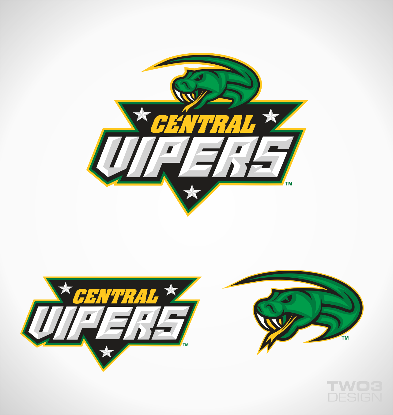
Central Vipers Rugby League sporting team logo
Want to win a job like this?
This customer received 65 logo designs from 18 designers. They chose this logo design from Fenceline Design as the winning design.
Join for free Find Design Jobs- Guaranteed
-
 A$200
A$200
-
 65 designs
-
 18 designers
Logo Design Brief
Central Vipers is a regional rugby league sporting team playing in the New Zealand national competition. It encompasses the mid central zone that has 4 districts in it. The representative teams from each of those districts include;
Taranaki Sharks
Manawatu Mustangs
Hawkes Bay Unicorns
Wanganui Rugby League
The zone jersey and other national teams can be viewed at http://nzrl.co.nz/national-competition.aspx
The jersey colours are green, yellow and black.
We originally had logo designs developed with a three headed viper that had a mustang, unicorn and shark head, however the design was a bit busy. It needs to be easily identifiable and stand out on a jersey.
Updates
Project Deadline Extended
Reason: Hi Everyone,
I have shown the submitted designs to the Board of Directors and their preference is that the unicorn, mustang and shark needs to be incorporated into the logo as a must have. As there are some good designs in there without this incorporation we are extending the deadline to give all designers the opportunity to amend their entry to include the three district logos.
I have just uploaded the original 3 headed logo that they keep referring to in our discussions. My suggestion is to use that logo as a starting point to improve upon. The words "strike hard, strike true" do not need to be there and the images themselves do not necessarily have to look the same way as the one in this logo. In general the board like the concept of that logo but are loking for a more professional and polished end result.
I hope this helps. Good luck and let me know if you have any questions.
Kind Regards,
Kelly
Added Wednesday, August 10, 2011
Hi Everyone, I have shown the submitted designs to the Board of Directors and their preference is that the unicorn, mustang and shark needs to be incorporated into the logo as a must have. As there are some good designs in there without this incorporation we are extending the deadline to give all designers the opportunity to amend their entry to include the three district logos. I have just uploaded the original 3 headed logo that they keep referring to in our discussions. My suggestion is to use that logo as a starting point to improve upon. The words "strike hard, strike true" do not need to be there and the images themselves do not necessarily have to look the same way as the one in this logo. In general the board like the concept of that logo but are loking for a more professional and polished end result. I hope this helps. Good luck and let me know if you have any questions. Kind Regards,
Kelly
Added Wednesday, August 10, 2011
Project Deadline Extended
Reason: Still waiting on some of the designers to update their logos after the briefing update comments.
Added Friday, August 26, 2011
Project Deadline Extended
Reason: Still looking for the best design we can get before a final decision will be made by our Board
Added Thursday, January 26, 2012
Logo Text
Central Vipers
Logo styles of interest
Emblem Logo
Logo enclosed in a shape
Pictorial/Combination Logo
A real-world object (optional text)
Character Logo
Logo with illustration or character
Look and feel
Each slider illustrates characteristics of the customer's brand and the style your logo design should communicate.
Elegant
Bold
Playful
Serious
Traditional
Modern
Personable
Professional
Feminine
Masculine
Colorful
Conservative
Economical
Upmarket
Requirements
Must have
- The words "Central Vipers"
The colours green yellow and black