Logo for Fostering Agency
Want to win a job like this?
This customer received 35 logo designs from 16 designers. They chose this logo design from SPLATmedia as the winning design.
Join for free Find Design Jobs- Guaranteed
-
 £150
£150
-
 35 designs
-
 16 designers
Logo Design Brief
www.fostering.in is an independent Fostering agency that seeks to find Foster Carers for Looked-after children throughout the UK.
There are about 400 private fostering agencies in which Foster Carers are able to decided who they would like to foster for, each company is different with varying forms of support offered.
This company is part of a company called Five Rivers which is a not-for-profit social enterprise, we have found that there are lots of large corporate companies seeking to find foster carers and they are able to put a lot of money into advertising which makes it difficult for us to find foster carers for our children.
Initially this website (which hasn’t been built yet) will focus on local areas.
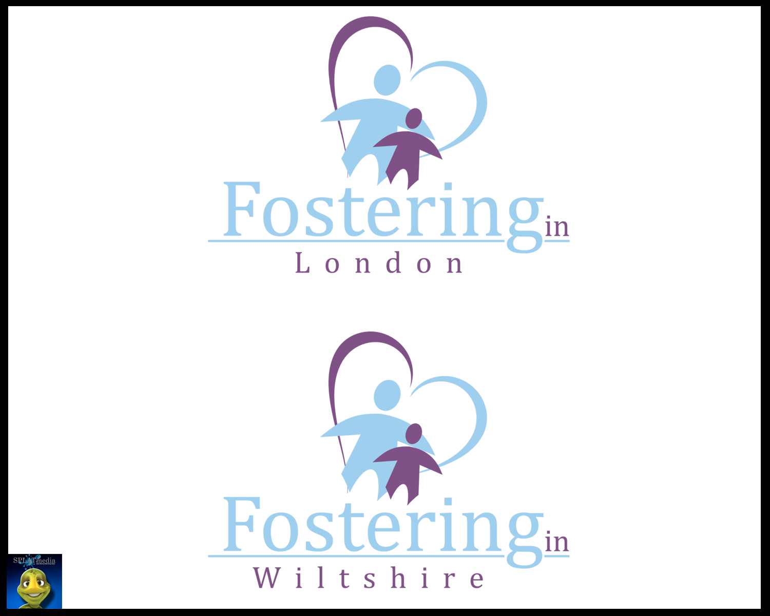
The second word on the logo would be variable an example URL www.fostering.in/london this will vary depending on the area we have an office providing a local brand. I’ve attached an example if that didn’t make sense!
So the purpose of this logo is to help create a localised brand that’s different compared to others.
I’m looking for a passion brand that evokes an emotional reaction that helps the audience engage with the subject matter.
Playful, and Colourful but not too much as it’s a highly professional and supportive service.
There’s a misconception about the children who are normally fostered. They’re normally over the age of 11 and have experienced traumatic backgrounds.
So the purpose isn’t to position the logo to look child friendly in a stereotypical sense.
An example of the owning company of this can be found at www.five-rivers.org to give you an understanding of the branding. (This logo should look completely different to Five Rivers)
Updates
The two most important elements on this logo are the word Fostering.in and then the location would be variable depending on which office I use it for.
For example I have 12 local offices throughout the UK, so I’ll vary the logo if I were creating a mico-site for my Wiltshire office, it would then read
Fostering.in Wiltshire
Fostering.in London
http://www.fostering.in/logo_example.gif
So the linking the content of the logo to a location isn’t too important as it will change depending on what I’m looking for.
The purpose of this marketing strategy is to show that I have a strong local presence in and around my regions allowing me to change when I need to.
Added Thursday, August 04, 2011
Target Market(s)
Families, Adults aged 21-60 years old
Industry/Entity Type
Advertising
Logo Text
Fostering in London
Look and feel
Each slider illustrates characteristics of the customer's brand and the style your logo design should communicate.