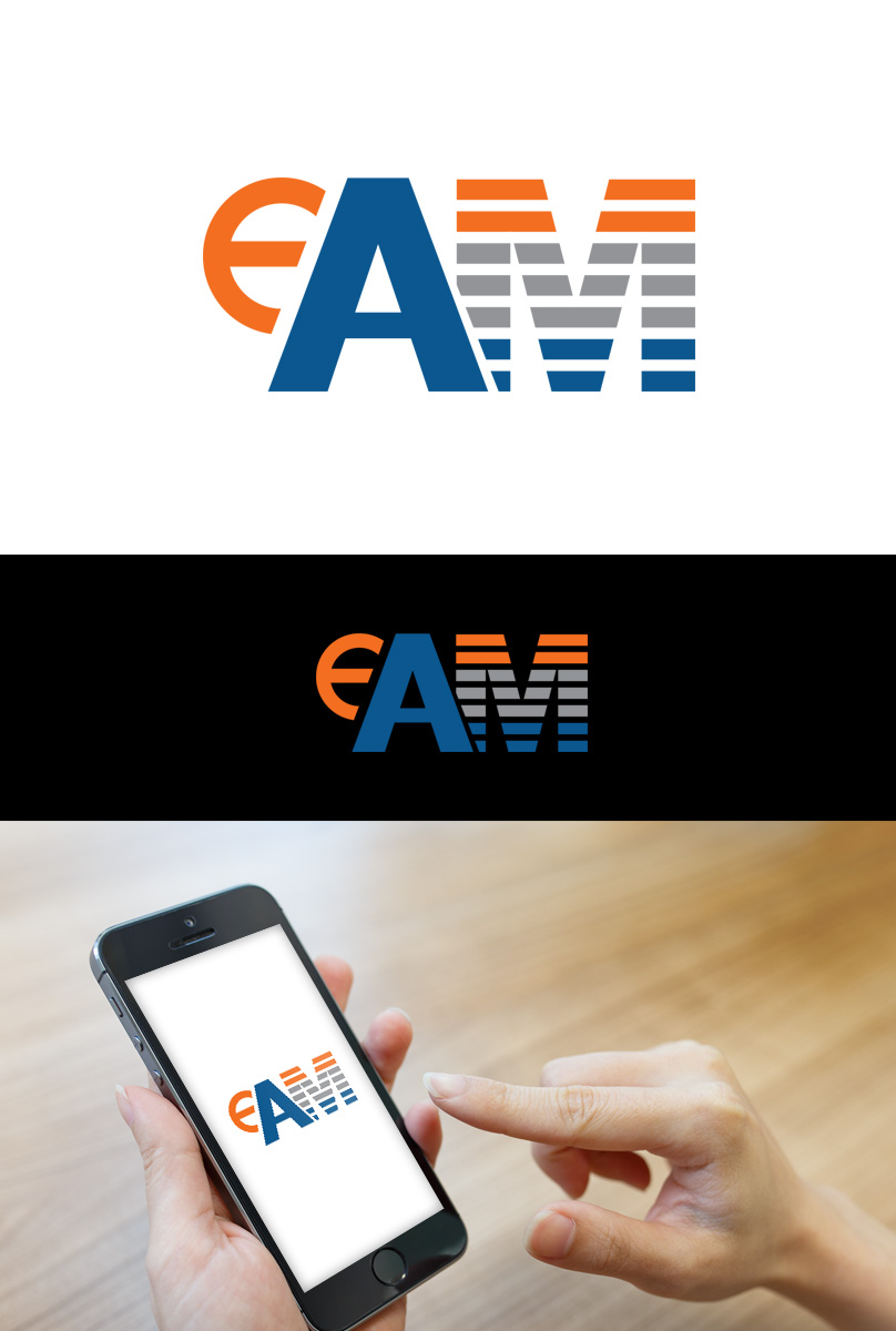
Updated business logo to reflect a shortening of our name - eAM logo
Want to win a job like this?
This customer received 40 logo designs from 27 designers. They chose this logo design from Artshit as the winning design.
Join for free Find Design Jobs-
 €120
€120
-
 40 designs
-
 27 designers
Logo Design Brief
We want to update our current name from "eAsset Management" to "eAM" as people find our current name a bit of a mouthful and is not easy to communicate
We therefore require an updated logo however we would like to keep some of the elements we like - these are the horizontal stripes in the "T" and the small "e"
Our legal entity will not be changing and will remain as "asset Management Limited or eAsset Management Inc"
We also have some existing logos for some of our intellectual property products and services - these are on the attached document for reference together with our current logo - we would like to keep these
We have standardised on the Calibri font on our written document templates
The new logo should allow us to keep our current brand style but we are open to suggestions
We have a website www.eassetm.com - please look at this
We are a Management Consulting business specialising in Asset Management and if asked to give ourselves a streamline it would be "making good better"
Thank you in advance for you input to our small but growing company
Target Market(s)
Large international businesses
Industry/Entity Type
Professional Service
Logo Text
eAM
Logo styles of interest
Abstract Logo
Conceptual / symbolic (optional text)
Wordmark Logo
Word or name based logo (text only)
Font styles to use
Other font styles liked:
- Calibri
Look and feel
Each slider illustrates characteristics of the customer's brand and the style your logo design should communicate.
Elegant
Bold
Playful
Serious
Traditional
Modern
Personable
Professional
Feminine
Masculine
Colorful
Conservative
Economical
Upmarket
Requirements
Must have
- See project description
Nice to have
- see project description