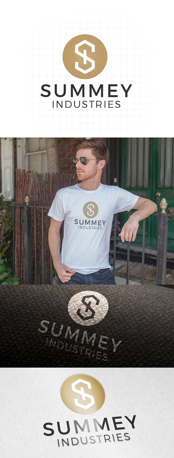
Summey Industries General Contracting Logo
Want to win a job like this?
This customer received 153 logo designs from 53 designers. They chose this logo design from Ahero Production as the winning design.
Join for free Find Design Jobs- Guaranteed
-
 US$160
-
 153 designs
-
 53 designers
Logo Design Brief
We need a logo that is simple enough that it can be embroidered in the top corner of a polo shirt and look sharp and memorable. It also needs to be legible while driving past a yard sign. We are a contracting company, so our yard signs are the size/placement of a realtor's sign.
Our services are completely different than other contractors, because our word is golden to us. Someone using price to differentiate is not going to choose us: we are expensive. Our niche is expensive remodels for people who care much more about the customer service they receive than the price tag on the job. Our quality, communication, processes, employees, and use of technology are all superior to others.
While we aren't a faith-based company (so you won't find this on our website), we are personally driven and motivated by this verse, which is our core verse: "Unless the LORD builds the house, the builders labor in vain. Unless the LORD watches over the city, the guards stand watch in vain." We don't want the logo to be an image of God building a house, but something that indicates a strong base or foundation would be great.
Words to describe us:
High end / expensive
Classy
Attention to detail
Niche
Customer Service
Clean Cut and Well Spoken Employees
Integrity
Confident
Humility
Trustworthy
Target Market(s)
Wealthy homeowners, willing to spend more money to get better service on a home build, renovation, remodel
Industry/Entity Type
Home Builder
Logo Text
We are open to an "S" logo or a "summey industries" logo, but our company name is Summey Industries
Logo styles of interest
Emblem Logo
Logo enclosed in a shape
Pictorial/Combination Logo
A real-world object (optional text)
Abstract Logo
Conceptual / symbolic (optional text)
Wordmark Logo
Word or name based logo (text only)
Lettermark Logo
Acronym or letter based logo (text only)
Font styles to use
Other font styles liked:
- We use "Geo Sans Light" in our marketing books.
Look and feel
Each slider illustrates characteristics of the customer's brand and the style your logo design should communicate.
Elegant
Bold
Playful
Serious
Traditional
Modern
Personable
Professional
Feminine
Masculine
Colorful
Conservative
Economical
Upmarket
Requirements
Must have
- A simple enough logo that it looks great and recognizable when embroidered on a polo shirt (not too complicated).
- A sharp one-color logo. (one color plus white)
Nice to have
- Fancy (expensive, classy) but clean look. Lots of older people are the homeowners, but they need to trust that our design aesthetic is current and not dated.
- We have preferred the logos that have come in that look straight or strong to the ornate "S" logos that are excessively loopy (because straight lines are imperative to proper building). We don't mind an S font, however.
Should not have
- anything too blatantly referencing houses or building bores us.
- many colors