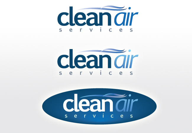
Corporate Main and Acronym Logo

Want to win a job like this?
This customer received 40 logo designs from 20 designers. They chose this logo design from Nathan Hallett as the winning design.
Join for free Find Design Jobs- Guaranteed
Logo Design Brief
In Business for 22 years and our logo continues to evolve as we have never had one officially designed.... so here we go. There are 2 Logo's attached. The first is what you woud find on our letterhead, envelopes, etc.. it is our main Logo. This Main Logo should reflect a Corporate identity that is highly professional, the element of wind or air movement could be incorporated. The second attached Logo is our basic Acronym CA (Clean Air) look. Our corporate color is a dark blue.
Updates
Project Deadline Extended
Reason: Hey Guys, I'm going to extend this project for a couple more days through this weekend, as i would like to see more submissions overall and i would also like to review the current submissions with my executive team.
Reagrds,
Wes
Added Friday, August 26, 2011
Target Market(s)
Engineers, Business Professionals
Industry/Entity Type
Business
Logo Text
Clean Air services
Look and feel
Each slider illustrates characteristics of the customer's brand and the style your logo design should communicate.