Web Design Project

Want to win a job like this?
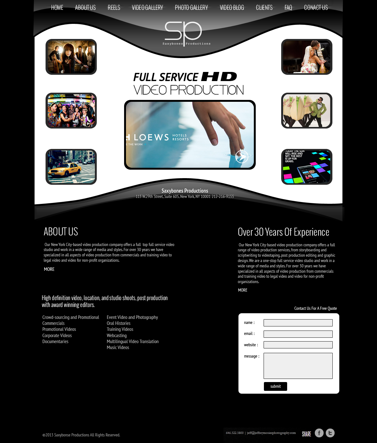
This customer received 18 web designs from 6 designers. They chose this web design from jeckx2 as the winning design.
Join for free Find Design Jobs- Guaranteed
Web Design Brief
This as the foundation http://metcreative.com/demo_viewer/index.php?theme=condomawp
Site needs to have a glossy black background with white text…..Extremely modern with a few flares of windows 8 style but nothing too off the wall, easily understood.
Here are some other reference sites and likes and dislikes that will help: (Probably overkill but we are looking for a cutting edge New York / LA Style )
http://www.chiandpartnersny.com
Like- The black background with white font is very eye catching and clean. Love the contrast. Black is a great background for photographs and videos
http://peterhurley.com
Like- Clean homepage, black and white color scheme works well.
http://jeffreymosierphotography.com
Like- Nice Menu, nice B and W contrast
http://www.ddb.com
Like- Like the Menu. Clean and easy.
http://www.indigoprod.com
Like- Contrast of white background with black font.
Like- Slide show of stills (but should be able to click images to go to video. We’d also like the name of the project)
Like- Drop down menu allows for customer to find service they need without going through all services.
Like- Tells you work that they do right next to the logo.
Dislike- Too much information on homepage. Too much scrolling.
http://www.highlinestudios.com
Like- High Res images on home page
Like - The About Me is on homepage and speaks to potential customer directly. “We create award-winning videos for companies like yours.”
Like- Blog is updated with new projects they do. And short, visual entries
Like- “Work” section stands out from website. The background fades to light grey and white when you click on “work” so that the portfolio stands out more. Makes color look more vivid
Like- Black and white color scheme with grey header
http://www.agency212.com
Like- High Res images on home page pointing to projects
Like- Photograph as background, changes with different links. So work is always showcased and creates contrast. Information is laid over a barely translucent background, which is laid over the picture.
Like- They have a good Attitude about quality of their product
http://www.atmosphere.net
Like- First thing you see when open page is a clear big statement about what they do, said in a catchy way. They have a Tagline.
http://behaviordesign.com
Like- How work is categorized. Client list has links, which take you to their Client page with all their work grouped together. Nice flow and organization shows client relationships. And nice descriptions of what the job was and how it was executed… Way too wordy at times though
http://www.brookelynphotography.com
Like- The homepage is very clean and accessible. Love the color scheme and how Logo is centered between the links.
Updates
Of the four designs we have gotten EVERY SINGLE ONE has been a template STOLEN from another site. We are paying for ORIGINAL design. Not copies and templates. Please ONLY submit original designs
Added Thursday, June 13, 2013
Industry/Entity Type
Foundation