A simple and smart interface for busy teachers
Want to win a job like this?
This customer received 67 web designs from 3 designers. They chose this web design from pb as the winning design.
Join for free Find Design Jobs- Guaranteed
-
 NZ$490
-
 67 designs
-
 3 designers
Web Design Brief
We have an existing app (hybrid) on Apple Appstore and Google Playstore that we wish to refresh with some awesome designs and simplified screens.
We would like to stick to our existing colour scheme, see our website jitbug.co.nz or screenshots on the appstore for more details and use of colours.
The uploaded files are current screens that we would like redesigned. Specifically, here are additional thoughts on what we wish to see:
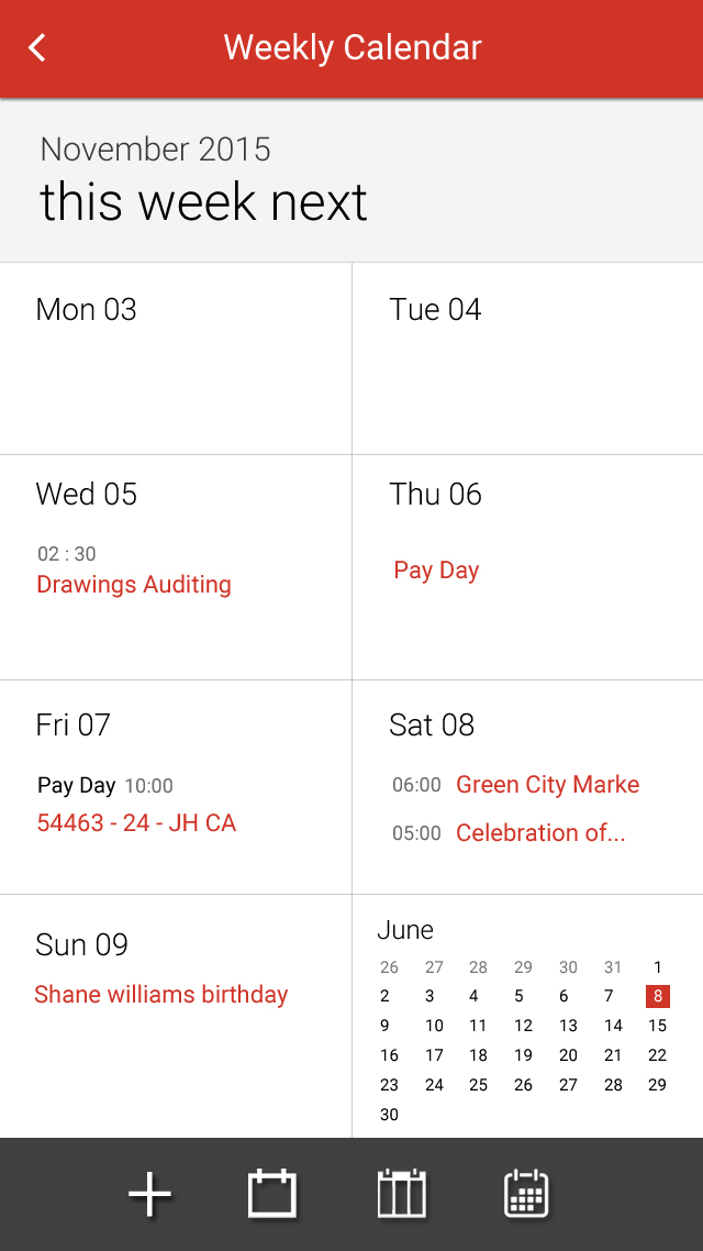
1. With the Active Jobs screen, we would prefer to see a week-ly calendar style layout.
2. With Favourites, we would like to see each person's availability going across the page.
Target Market(s)
Middle aged women. (40+). New to tech users.
Industry/Entity Type
Education
Number of Pages Required
5+ page
Font styles to use
Colors
Colors selected by the customer to be used in the logo design:
Look and feel
Each slider illustrates characteristics of the customer's brand and the style your logo design should communicate.
Elegant
Bold
Playful
Serious
Traditional
Modern
Personable
Professional
Feminine
Masculine
Colorful
Conservative
Economical
Upmarket
Requirements
Must have
- Calendar view.
- Tidy and sharp info about the jobs.
Nice to have
- Simple and sharp.
Should not have
- Complicated graphics.
- Cluttered designs.
- Too much red. Screens should be mainly white(ish) with red and black.