Legal Recruitment Firm Needs Wordpress Design
Want to win a job like this?
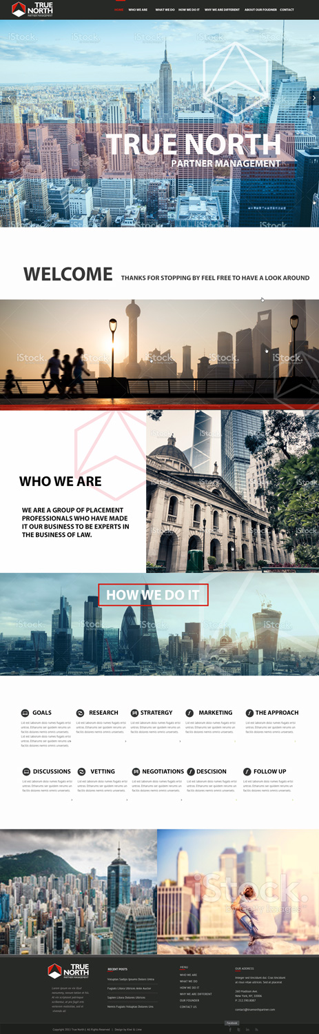
This customer received 24 web designs from 3 designers. They chose this web design from Kiwi & Lime Design as the winning design.
Join for free Find Design Jobs- Guaranteed
-
 US$250
-
 24 designs
-
 3 designers
Web Design Brief
We are a legal recruitment firm that represents partner-level attorneys in the top 200 law firms in the world in their move from one law firm to another. I am the founder, and am a twice published author, and I write a column for American Lawyer and Forbes.
My site will have 6 "pages" -- Who We Are | What We Do | How We Do It | Why We Are Different | About Our Founder | Contact Us -- and a blog (where I can post my Forbes interviews).
I have attached my logo, and expect that the color/design will follow from that. Where colors are concerned, I like blacks, grays, reds, deep blues, etc.
I'd like to use the Salient Agency theme -- http://themenectar.com/demo/salient-agency/
It is fairly simple, I like the full width page display, and I really like the video that plays in the background rather than just a static picture. So I’d like to have a video like this, but perhaps one made of short clips of the streets of NY, London, Hong Kong, etc. (We service attorneys around the world). It wouldn't have to be that, specifically, however -- I will leave the creative aspect up to you.
Please note: (i) I haven't purchased the theme as of yet, so I don't HAVE to use that theme. One that is comparable will do just as fine. Also, (ii) I don't want the typical stock photos of "business people." I really want this to look professional, and think that the stock photos of business people look cheap -- you know, the business websites of the 90's look.
Any photos we would use would have to be fresh, contemporary, and of high quality.
Below are the other themes that I like, and why I like them. I think this will help you to better understand the look/feel that I would like to achieve.
http://themenectar.com/demo/salient-agency/
-- This is a beautiful theme. And I really like the video in the beginning. I'd love to have a video like this for my page. Perhaps video of the streets of New York, Hong Kong, London, etc? Rather than just a static picture, a video like this?
http://themes.themegoods2.com/?theme=PhotoMe
-- This is another very beautiful theme. I like -- very much -- the simplicity of the blog. The picture is beautiful. I don't think that the picture really caters to my business/industry, but it is amazing. I like the sprawling picture, the easy to follow menu, etc.
http://themeforest.net/item/howl-creative-multipurpose-wordpress-theme/full_screen_preview/10739143
-- Another beautiful theme. I really like the sprawling picture. I like the color pallette, as the white letters contrast nicely against it. The menu looks simple. In particular, as you scroll down, I like the video of the New York traffic -- it really adds to the quality, I think.
http://demowp.cththemes.com/mex/
I like the very clean look of this theme. Only one menu, and that menu only navigates to a single place on the site. The big, full screen, sprawling picture is great, and the font is great. I like the contrast of the white letters against the picture.
http://www.cssigniter.com/chords/
-- Not necessarily a great site, but I do like the full-screen picture, and i like the black/gray. I don't like the fonts. I like block lettering with clean, square lines.
http://demo.themeisle.com/parallax-one/
-- I like the big sprawling picture. The colors aren't bad. I like the white contrasting letters. I like that when you scroll down, there is good, clean division between the sections. The clip art of the people looks like, well, clip art. The polished people in suits just looks bad. I really don't like that. The photos should look fresh, contemporary, high def., etc.
http://themeforest.unitedthemes.com/wpversions/brooklyn/landing/
-- I like the look of the landing page. This is mainly earth colors -- browns -- which, I want mine to follow the colors of my logo (or contrast in an intelligent way), but I like the big sprawling picture, and the white letters. I like as you scroll down that the division between the sections is more prominent -- you know when you are in a particular "section."
http://demo.elated-themes.com/moose/
-- I like the look of the landing page, but as you scroll down, it becomes too busy. This may just be because of the content they've put in, though.
Target Market(s)
Partner-level attorneys at the top 200 law firms in the world.
Industry/Entity Type
Law Firm
Number of Pages Required
5+ page
Font styles to use
Look and feel
Each slider illustrates characteristics of the customer's brand and the style your logo design should communicate.
Elegant
Bold
Playful
Serious
Traditional
Modern
Personable
Professional
Feminine
Masculine
Colorful
Conservative
Economical
Upmarket
Requirements
Must have
- This will be the customization of an existing Wordpress theme, so I expect to receive that -- not simply an adobe mock up.
- Block-style fonts with square edges.
Nice to have
- I've included a significant amount of information in the job description.
Should not have
- Cheap-looking stock photos.