HIKE - New Clothing Brand Logo Design
Want to win a job like this?
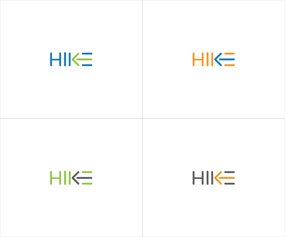
This customer received 193 logo designs from 67 designers. They chose this logo design from Roy as the winning design.
Join for free Find Design Jobs- Guaranteed
-
 £250
£250
-
 193 designs
-
 67 designers
Logo Design Brief
HIKE is a new clothing brand focused on the dinghy sailing market. To begin with we will be producing high quality casual wear such as T shirts and hoodies. As the brand gains popularity we will extend our range of casual and technical clothing, to include jackets, fleeces, knitwear, etc.
The T shirts designs are bold, edgy and aimed at a young, cool market, but they are also designed to last and be a favorite item of clothing.
The brand name 'Hike' comes from the term used in sailing where you lean your body over the side of the boat to maximise the leverage of your bodyweight and therefore sail faster. It is nothing to do with walking or trainers.
We aspire to be a brand comparable to the surf clothing labels Quiksilver, Roxy, Billabong, Rip Curl, O'Neill ect. But completely focused on sailing and not associated with surfing or other boardsports.
Looking for a HIKE text logo and a symbol logo. Both should be simple enough to be embroidered onto clothing, but also look great in high res on the website.
I have attached some photos that show dinghy sailors 'hiking' out, just to illustrate what it means.
Updates
Hi, here's an update to all of you who have submitted designs so far or accepted the invitation.
The logos I like so far are the simple and bold ones, mainly just text based, without sails, waves or boat like shapes in them.
The reason for this are as follows,
I'm not keen on the wave images because they make me think of the surf brands like quicksilver.
I'm not keen on the sail or boat images as there are quite a few yachting brands that use the sail or boat sillouttes in their logo's already, like Musto, and I want to be different to them.
There are also a few submissions that have shapes which look a bit like mountains or hills, and this makes it look like a Hiking brand, which we are not.
I really like text only logos as they are very versatile and simple to embroider or print onto clothing. They can also be used in word play slogans on T shirts, like 'Hike to win" "born to Hike" "Hike harder, better, faster".
The 2 designs I like the best have used the vertical and horizontal shapes in the capital letters HIKE very cleverly, and if you use the angles of the K with the centre line of the E, there is an arrow pointing left, which I am very keen to see brought out in a design.
Hope this helps, I am going to make this a guaranteed prize and possibly extend it for a few more days to get more entries in.
thanks very much for looking at this.
Tim
Added Friday, July 12, 2013
Project Deadline Extended
Reason: get some more entries in.
Added Friday, July 12, 2013
Target Market(s)
Young (15-40) active people who sail and\or aspire to race boats like their Olympic and America's Cup heros.
Industry/Entity Type
Clothing
Logo Text
HIKE
Logo styles of interest
Abstract Logo
Conceptual / symbolic (optional text)
Wordmark Logo
Word or name based logo (text only)
Look and feel
Each slider illustrates characteristics of the customer's brand and the style your logo design should communicate.
Elegant
Bold
Playful
Serious
Traditional
Modern
Personable
Professional
Feminine
Masculine
Colorful
Conservative
Economical
Upmarket
Requirements
Should not have
- Any similarity at all with the leading trainer brand of a similar name. Any swooshes or similar typeface to them will be rejected.