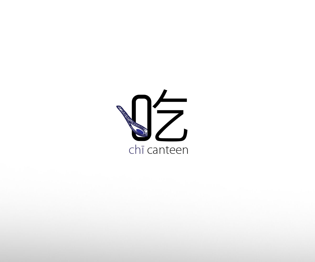
Logo for an upcoming Chinese restaurant
Want to win a job like this?
This customer received 143 logo designs from 46 designers. They chose this logo design from natureborn as the winning design.
Join for free Find Design Jobs- Guaranteed
-
 US$400
-
 143 designs
-
 46 designers
Logo Design Brief
The Brief:
Design a logo for an upcoming Chinese restaurant, called 吃 chī canteen.
A Note:
We intend to work with the winning logo designer to build an eventual design toolkit (budget of up to US$4,000), which will include templates of calling cards, menu, posters, flyers, signage, uniform, carrier bags, etc.
The Concept:
The Chinese character 吃, pronounced chī, means — “eat”. It sounds like the tail-end of “teacher”... — “cher”.
吃 chī canteen is where you can very simply, chī canteen-style Chinese food.
It’s inspired by mixed rice stalls — the Chinese version of fast food, which are common in South East Asia. Just pick the dishes you want over your rice, pay at the counter, and dig in.
Our idea is to bring the same authentic (Asian) Chinese food to... a certain city, much like Gotham, but to do it classily — without the swank that makes it inaccessible, and without the grittiness that makes it just another chop suey restaurant.
The Theme:
The rice bowl is associated predominantly with the Chinese culture.
Naturally, at 吃 chī canteen, the rice bowl (blue & white porcelain) takes centre-stage — both in theme and décor, and in the way we serve our food.
Although, the allusion to being a Chinese restaurant is apparent in the theme; 吃 chī canteen avoids kitsch Chinese iconography like lanterns, dragons, fortune cookies, peonies, and... Chairman Mao.
Meanwhile, long tables and benches make eating at 吃 chī canteen; a casual, modern, unintimidating, and communal experience.
The One-liner Brief for Lazy Readers:
A modern wordmark or pictorial logo for 吃 chī canteen, a cafeteria-style Chinese restaurant that dishes out complete meals in rice bowls.
Thanks for your time!
Target Market(s)
White-collar on weekdays, trendy leisure-class on weekends.
Industry/Entity Type
Restaurant
Logo Text
吃 chī canteen
Logo styles of interest
Pictorial/Combination Logo
A real-world object (optional text)
Wordmark Logo
Word or name based logo (text only)
Look and feel
Each slider illustrates characteristics of the customer's brand and the style your logo design should communicate.
Elegant
Bold
Playful
Serious
Traditional
Modern
Personable
Professional
Feminine
Masculine
Colorful
Conservative
Economical
Upmarket
Requirements
Must have
- The Chinese character 吃 and its pronunciation, which is chī (notice the accent).
- chī canteen should also appear either all in lower case, or all in upper case.
- 吃 is an important element of the logo, but the rice bowl is not, so you can skip icons of bowls altogether if you like.
Nice to have
- 3 logo versions; full colour, black and white, and keyline for embossing purposes.
- Show application if the proposed logo design is flexible i.e. whether 吃 and chī canteen can be separated, whether chī can appear underneath 吃, or whether 吃 must always be followed with chī canteen, etc.
- No preferred font type, but would like to see a version using Century Schoolbook.
- Open to modern Chinese calligraphy/Chinese watercolour-type text.
Should not have
- Overt and typical Chinese references i.e. dragons, seals, peonies, fortune cookies, chopsticks, etc.
- Retro, graffiti, vintage, or Warhol.
- Comic freaking Sans, and its related typographic friends.
- Red, pink, and fluorescent anything.