Payerne Estavayer v2
Want to win a job like this?
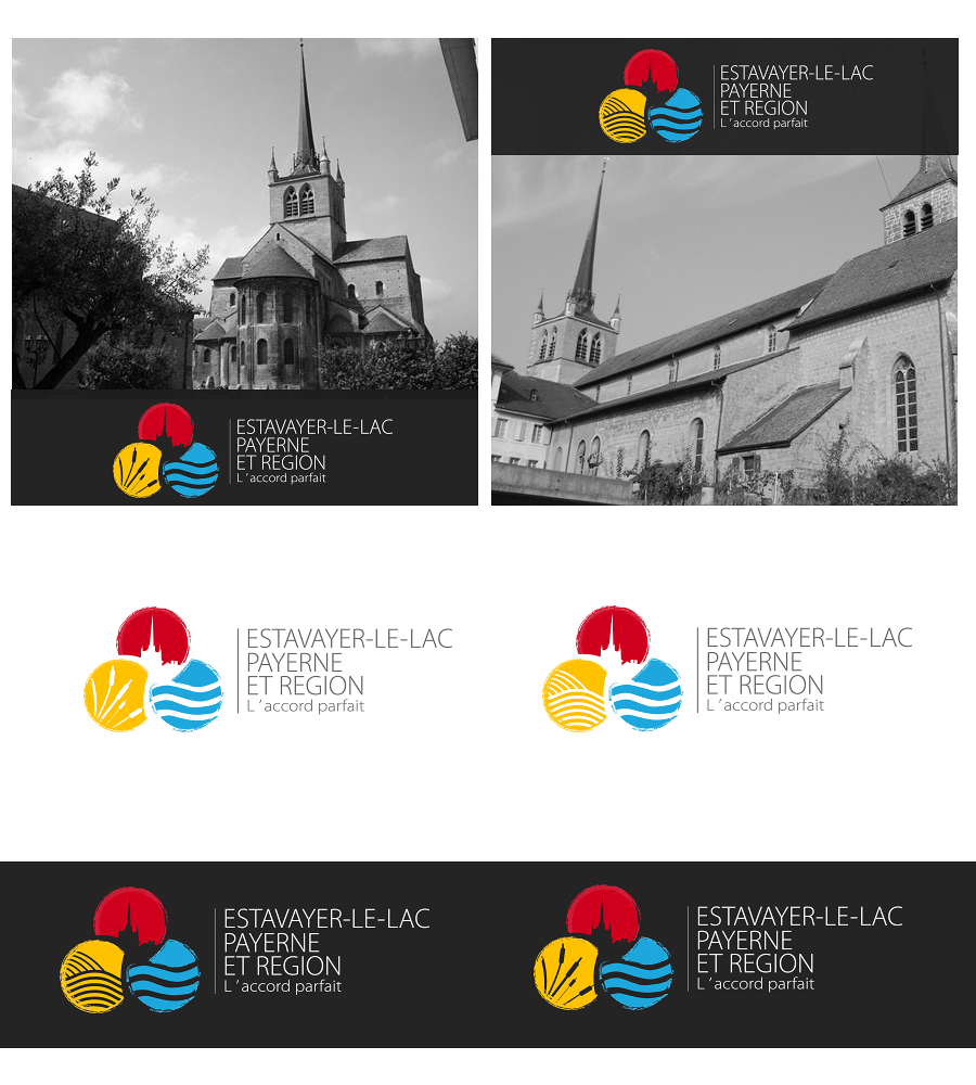
This customer received 60 logo designs from 33 designers. They chose this logo design from Kolor as the winning design.
Join for free Find Design Jobs- Guaranteed
-
 €150
€150
-
 60 designs
-
 33 designers
Logo Design Brief
I need a vectorised finalised version of this logo sketch, sticking very closely to this design but with two changes: the three colours to use for the spheres are red, yellow and blue; and the yellow sphere should be reworked with two options - one with reeds/bulrushes, and one with the furrows of a ploughed field.
The vertical line between the logo and text should not be too thick.
Overall the aim is to produce a usable finished logo, but keeping the dynamism of the original sketch.
The building in the red sphere is the Abbatiale in the town of Payerne, with its distinctive tower shape.
Target Market(s)
tourists, local residents, daytrippers. Used for signage etc as well as stationery and marketing
Industry/Entity Type
Building
Logo Text
exactly what it says on the sketch (there is an apostrophe in "l'accord parfait" which isn't clear
Look and feel
Each slider illustrates characteristics of the customer's brand and the style your logo design should communicate.
Elegant
Bold
Playful
Serious
Traditional
Modern
Personable
Professional
Feminine
Masculine
Colorful
Conservative
Economical
Upmarket
Requirements
Must have
- Close relationship to the sketch. Interlinked spheres as in sketch, relationship between graphic and text elements as in sketch. Two options, one with reeds/bulrushes, the other with ploughed furrows. Abbatiale in red sphere. Yellow instead of green.
Should not have
- Not too stiff or formal. Should not look too municipal in its treatment.