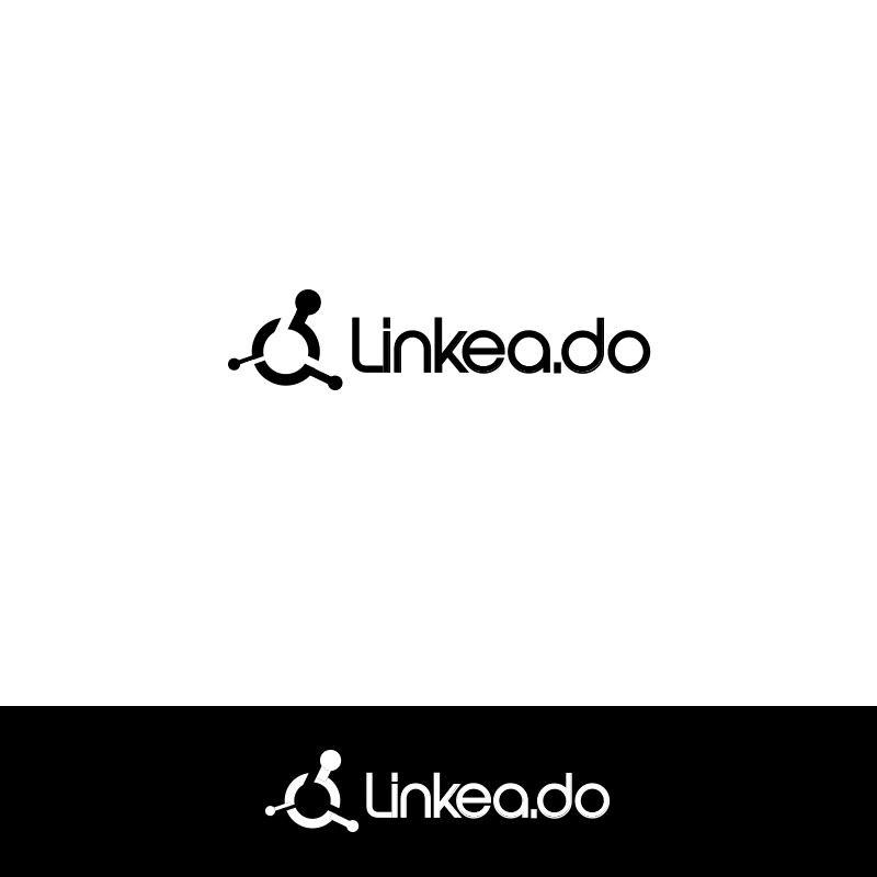
Tech Blog Logo redesign

Want to win a job like this?
This customer received 97 logo designs from 36 designers. They chose this logo design from Alchemist as the winning design.
Join for free Find Design Jobs- Guaranteed
Logo Design Brief
We are a tech blog still growing. We have a logo that has always been a draft, but it has worked and some people like it. The thing is this logo is too complicated as it's scanned (in the first place), and making businees cards and new designs based on it (like our podcast logo) has been really hard. So we're actually looking for something similar, but easier to work on.
Our blog is: http://linkea.do. We believe in our project, and making it "look good" is very important.
The meaning of Linkeado (which actually is a spanglish expression) it's like "Linked"
Target Market(s)
young people (17 - 26) interested in tech
Industry/Entity Type
Tech
Logo Text
"Linkea.do" or "Linkeado"
Logo styles of interest
Abstract Logo
Conceptual / symbolic (optional text)
Character Logo
Logo with illustration or character
Font styles to use
Colors
Designer to choose colors to be used in the design.
Look and feel
Each slider illustrates characteristics of the customer's brand and the style your logo design should communicate.
Elegant
Bold
Playful
Serious
Traditional
Modern
Personable
Professional
Feminine
Masculine
Colorful
Conservative
Economical
Upmarket
Requirements
Must have
- The logo must be understood by itself for our users, thus avoiding competing with their knowledge and creativity.
Nice to have
- A flat design is preferable.
Flat Colors http://flatuicolors.com/
Sans Serif would also be preferable.
Our logo is based on an atom, we did it this way so it could simulate "connections" or "linking" (trying to approach Linkeado's meaning). So it would be nice to see a logo that represents these "linkings" or "connections". Remember that Linkeado is like saying "Linked".
Taking these keywords: "Linked", "Tech", "Web", "Blog"; might give you a good idea
Should not have
- Should not include any object resemblance to reality.
Avoid Skeuomorphs (if possible)
Avoid using something like seals (stamps) or similar
Try to avoid four or more colors
Avoid the use of Serif Fonts