Logo design for our new online company.
Want to win a job like this?
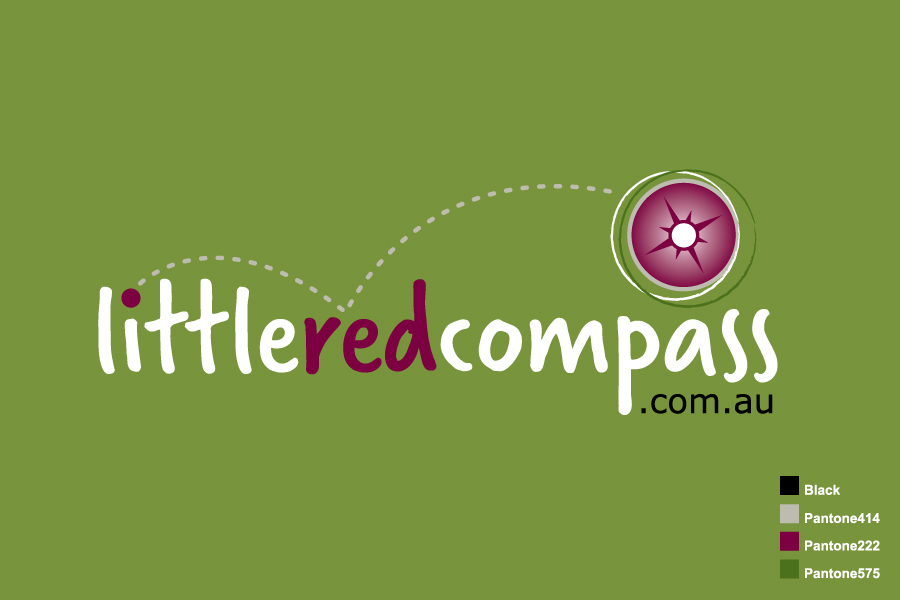
This customer received 67 logo designs from 28 designers. They chose this logo design from Nuts Creative as the winning design.
Join for free Find Design Jobs- Guaranteed
-
 A$300
A$300
-
 67 designs
-
 28 designers
Logo Design Brief
Little Red Compass is an online directory of businesses, organizations and institutions catering to children from infants to teens.
The web site is currently being developed and I have attached a sample of the website header in MS- Word for your information (this is to be used as reference in relation to how the logo would fit it).
The logo should be…
- simple and clean (not busy looking)
- contemporary (not tacky)
- fresh
- fun (indicates website has to do with kids)
- lively
The logo will be used on the website, business cards, corporate merchandise and gift packs.
Target Market(s)
Audience/Users
• Primary users are parents with kids ranging from new born to late teens
• Parents-to-be
• Anyone looking for goods and services for kids and parents (e.g. gifts for nephew or baby shower present)
• Teenage kids
Customers
• Our customers will be businesses providing kids related products and services
• Organizations catering to kids and parents
Industry/Entity Type
It Company
Logo Text
little red compass .com.au
Logo styles of interest
Pictorial/Combination Logo
A real-world object (optional text)
Abstract Logo
Conceptual / symbolic (optional text)
Wordmark Logo
Word or name based logo (text only)
Lettermark Logo
Acronym or letter based logo (text only)
Requirements
Must have
- • The following colours may be used for the logo (olive green, dark/blood red, tan, black, grey, white, off-white). It is important that the colours selected must compliment with the overall look and feel of the website.
• Allow a space for a tag line which may be added in future
• Incorporate a sketch / illustration of a compass in abstract form in the logo (must be simple and modern but nothing too outrageous or tacky).
• Must be adaptable / flexible as the logo should look good in either a dark background (e.g. dark shade of olive green, black) or a lighter background (e.g. white, light shade of olive green)
Should not have
- Logo must not be…
• Tacky
• Busy looking
• Too outrageous