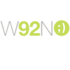
"Trinki" Mobile banking for Young People
Add your question or comments below

Feedback please :)
not that i'm surprised. but this customer clearly has no understanding of kerning.
sad.
I think that your design is unreadable. You didn't understand our needs. How you mention about kerning? :)
this wasn't supposed to be about my design vs anyone else's i was simply pointing out that the kerning in the one you chose was haphazard.
kerning: the visual spacing between letters. the spacing between the T and r, (too wide) and the n and k (WAY too tight).
i don't mid that you don't care for my design. taste, as well as the understanding of the function of a logo is subjective. but i take issue when you say that i "didn't understand" your needs. let's look closer at your needs, as stated by you:
in your brief, you said "We targets teens between 10 - 18 years old"
and "Teens between 10 to 18 in Turkey AND Family members."
ultimately, i think the design you chose appeals more to 4-7 year olds and completely NOT 8-18 nor OLDER family members.
my approach was to make something fun enough to appeal to youths. but complex enough to be interesting to the older teens and adults.
i also kept true to the colors that you presented. the one you chose added yellow.
again. i don't begrudge you your taste. that's totally up to you. but when you say that i didn't understand your needs. THAT, i will argue.
i'll also point out that one of the two reference logos you provided. "buxx" could have been read as buDoc or bucoc. so i was under the impression that you wanted something with a little ambiguity to it's perception.
again. i'm not bothered that you didn't choose my work. but i am bothered when you give me a low review and say that i didn't understand your needs. when in fact i probably understand them better than you do.
: (
Thank you. Yes it is a matter of taste. May be next time.
Best Regards
-
 Previous page
- You're on page 1
- Page 1 of 1
-
 Next page
1 - 6 of 6 comments