Maipak Solutions (Maione packaging solutions)
Want to win a job like this?
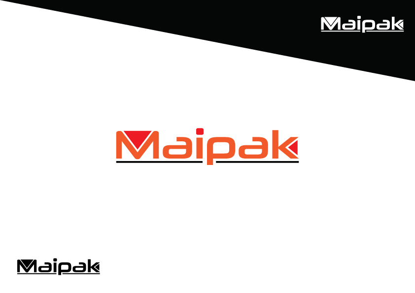
This customer received 92 logo designs from 32 designers. They chose this logo design from Zeeshan Ali as the winning design.
Join for free Find Design Jobs- Guaranteed
-
 A$170
A$170
-
 92 designs
-
 32 designers
Logo Design Brief
Maipak is a recently established family business from South Australia. We are a packaging company, who contract out to other businesses to pack their products ready for wholesale and retail market. Our main focus is within the coffee industry – we contract to coffee rosters to pack their coffee in capsules for them to on sell to the retail market. While our focus is currently within the coffee industry, we have the ability and idea to expand to other forms of consumables and products.
Updates
Project Deadline Extended Reason: updated brief to be more specific in what is required for our logo Added Monday, April 11, 2016
Target Market(s)
Maipak is a contactor to businesses providing a service to package their products. Maipak appeals to the food and beverage market, providing a service to businesses to assist them with packing their products. Maipak does not have a presence in the retail market for an end buyer.
Industry/Entity Type
Business
Logo Text
Maipak Solutions
Logo styles of interest
Abstract Logo
Conceptual / symbolic (optional text)
Wordmark Logo
Word or name based logo (text only)
Lettermark Logo
Acronym or letter based logo (text only)
Font styles to use
Colors
Colors selected by the customer to be used in the logo design:
Look and feel
Each slider illustrates characteristics of the customer's brand and the style your logo design should communicate.
Elegant
Bold
Playful
Serious
Traditional
Modern
Personable
Professional
Feminine
Masculine
Colorful
Conservative
Economical
Upmarket
Requirements
Must have
- Logo needs to be easy to work with when designing brochures, leaflets, web pages etc. We would like Maipak logo and design to be simple but effective, integrating sharp and clean text and colour.
Nice to have
- A logo with a symbol which is part of the 'Maipak' text, however is also able to stand alone as trade mark of the company.
Should not have
- Logo should not be too complex nor have too many colours.