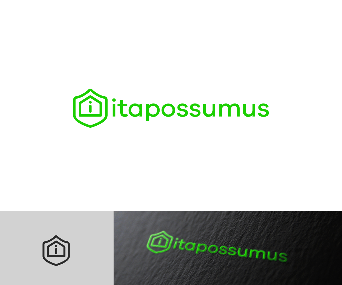
Innovative logo design for property repair company

Want to win a job like this?
This customer received 142 logo designs from 46 designers. They chose this logo design from raph as the winning design.
Join for free Find Design Jobs- Guaranteed
Logo Design Brief
We need a logo design for a new company based in London, also possibly opening in an office in Dubai.
We specialise in property insurance repairs and medium-to-large scale property refurbishments. Our aim is to provide insurance companies and property owners with access to a team of building specialists who will act on their behalf to accurately scope the required work, source competitive quotes and oversee the contractors from start through to finish without increasing the cost of the project.
Each of our customers is appointed a dedicated case handler to help them coordinate all aspects of their project, keep them updated on progress and address any questions or concerns they may have along the way. We also ensure adherence to health and safety regulations, perform customer satisfaction surveys and carry out regular spot checks on our contractors to ensure that the high standards we expect are being maintained.
The colour green or blue should be used, not both together but possibly with another shade of the same colour or a grey/black. We want to be seen as a professional, modern company. The final design should ideally communicate quality, efficiency/control, trustworthiness/reliability and initiative.
Target Market(s)
Property owners and insurance companies
Industry/Entity Type
Building
Logo Text
Itapossumus
Logo styles of interest
Abstract Logo
Conceptual / symbolic (optional text)
Wordmark Logo
Word or name based logo (text only)
Font styles to use
Look and feel
Each slider illustrates characteristics of the customer's brand and the style your logo design should communicate.
Elegant
Bold
Playful
Serious
Traditional
Modern
Personable
Professional
Feminine
Masculine
Colorful
Conservative
Economical
Upmarket
Requirements
Must have
- Green or blue in the logo (not both)
Nice to have
- The use of an abstract symbol/image that we can use with or without the company's full name to be recognised. We would consider writing itapossumus without a capital I if it looks more pleasing for the logo. The image attached to the brief is from another logo designer. I quite like it, but somehow it doesn't feel professional enough. If someone is able to make a more refined version, it might be the winner!
Should not have
- Should not look like a standard building contractor's logo (eg bright red with a hammer!). The idea is that we are more than just a builder - we are property professionals who coordinate projects and protect the customer's interests.