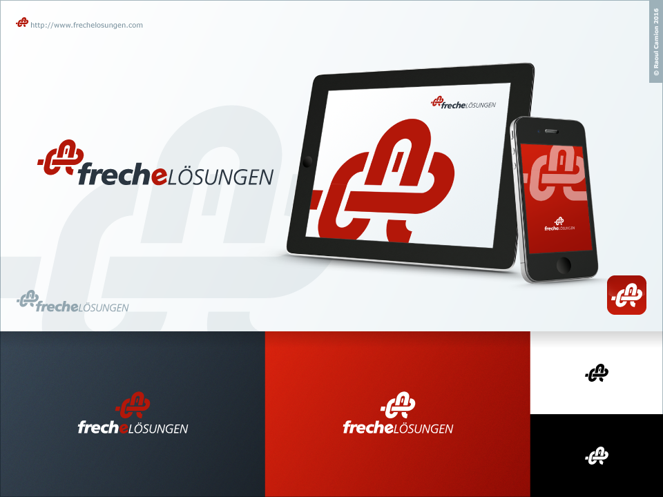
Redesign Logo for Freche Lösungen = Cheeky Solutions ;-)
Want to win a job like this?
This customer received 47 logo designs from 21 designers. They chose this logo design from Raoul Camion as the winning design.
Join for free Find Design Jobs- Guaranteed
-
 €120
€120
-
 47 designs
-
 21 designers
Logo Design Brief
I want my existing Logo to be redisigned. In the moment, the logo is not compact enough and not modern enough.
To insert the current logo on a webpage, you need it to be relative high - otherwise you can't read the company name very well.
A good example for a compact Logo is the one from DesignCrowd ..
I want to keep the PSEUDO KNOT (!!!) and the company name "Freche Lösungen"
It would be nice to see the knot in a new style (abstract, cartoon style)
Font used is Frutiger 55 Roman
Target Market(s)
IT consulting / IT project management / CMS development
Logo Text
Freche Lösungen
Logo styles of interest
Abstract Logo
Conceptual / symbolic (optional text)
Font styles to use
Look and feel
Each slider illustrates characteristics of the customer's brand and the style your logo design should communicate.
Elegant
Bold
Playful
Serious
Traditional
Modern
Personable
Professional
Feminine
Masculine
Colorful
Conservative
Economical
Upmarket
Requirements
Must have
- I want to keep the PSEUDO KNOT itself without the long string.
- The pseudo Knoten can be in a new e.g. abstract / cartoon style.
- Color should be existing RGB 160,0,0 or something impressing new ;-) The pseudo knot is also called bottles knot - without the bottle in the knot it is easy to open the knot. If a bottle is in the knot pulling the string will tighten the knot. Please look at the uploaded current logo!!!