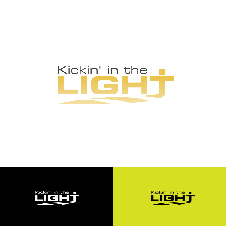
What does it mean to be the light?

Want to win a job like this?
This customer received 50 logo designs from 21 designers. They chose this logo design from Spektron Designs as the winning design.
Join for free Find Design Jobs- Guaranteed
Logo Design Brief
Kickin‘ in the Light foundation was created in 2012 by Matt Ward of Wilmington, North Carolina. Matt combines his passion for soccer with a desire to teach others how to have a positive outlook in all circumstances. Kickin' in the Light holds soccer clinics for youth, gives presentations about positive health with a Christian perspective, and travels to other parts of the world sharing a love of Jesus and soccer. A portion of the proceeds are donated to youth organizations that promote positive mental health in memory of Matt’s Dad, Dr. David Ward. Matt would like a design that is clean, bold, modern and simple. The logo will be primarily used on t shirts and signs. He would like to incorporate a Christian cross, possibly in place of the T in "light". Do not include a soccer ball in the design. Matthew would like a horizontal design that runs the length of a t shirt.Thank you so much for your consideration and creativity!
Target Market(s)
high school students
Industry/Entity Type
Foundation
Logo Text
Kickin' in the Light
Logo styles of interest
Wordmark Logo
Word or name based logo (text only)
Font styles to use
Look and feel
Each slider illustrates characteristics of the customer's brand and the style your logo design should communicate.
Elegant
Bold
Playful
Serious
Traditional
Modern
Personable
Professional
Feminine
Masculine
Colorful
Conservative
Economical
Upmarket
Requirements
Must have
- logo text
Nice to have
- Cross in place of the T in "light" or a cross somewhere in the design
Should not have
- soccer ball