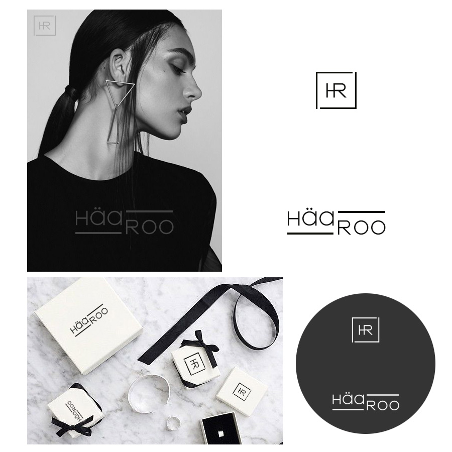
Logo design for accessories brand “HäaRoo”

Want to win a job like this?
This customer received 122 logo designs from 43 designers. They chose this logo design from DominicDesign as the winning design.
Join for free Find Design Jobs- Guaranteed
Logo Design Brief
We want to have a logo that represents “Silver accessories” which it would be very simple but standout. We need both symbol and text for our brand. For symbol, we would like to have a very small symbol so it can be stamp it on every piece of our products. Our products include rings, bracelets, necklace and earrings. For the text, it can be simple handwriting or plain text or may add a little italic to the text to make the look softer. Our brand name call “HäaRoo”. We want H and R to be capital letter to make it stand out but also have a soft feeling itself because it is a womenswear. Also, the name of HäaRoo comes from Korean language which means everyday. Therefore, the logo should represent everyday womenswear accessories that look simple, tender and standout with simple clothing style and everyday wear.
Target Market(s)
Women with middle income age between 18-35 years of age
Industry/Entity Type
Jewelry
Logo Text
HäaRoo
Logo styles of interest
Wordmark Logo
Word or name based logo (text only)
Lettermark Logo
Acronym or letter based logo (text only)
Font styles to use
Look and feel
Each slider illustrates characteristics of the customer's brand and the style your logo design should communicate.
Elegant
Bold
Playful
Serious
Traditional
Modern
Personable
Professional
Feminine
Masculine
Colorful
Conservative
Economical
Upmarket
Requirements
Must have
- Symbol and text logo
Nice to have
- "HäaRoo" This is our brand name. We would appreciate that H and R is capital letter and also the first " ä " have two dots above the letter. This is final update " don't put Seoul under brand name. Also, no more handwriting font. Please make the font more unique but still simple. For example, high end luxury bag such as Chanel, Dior and Tiffany co. They all have unique font. Please refer to the product description for the idea. Symbol is needed too
Should not have
- Too many colors, just 1 or 2 color is good enough.The appearance of logo should not look like picture or drawings because it looks too complicated and messy