Association for Women Leaders in College Sports Needs T-Shirt Designs
Want to win a job like this?
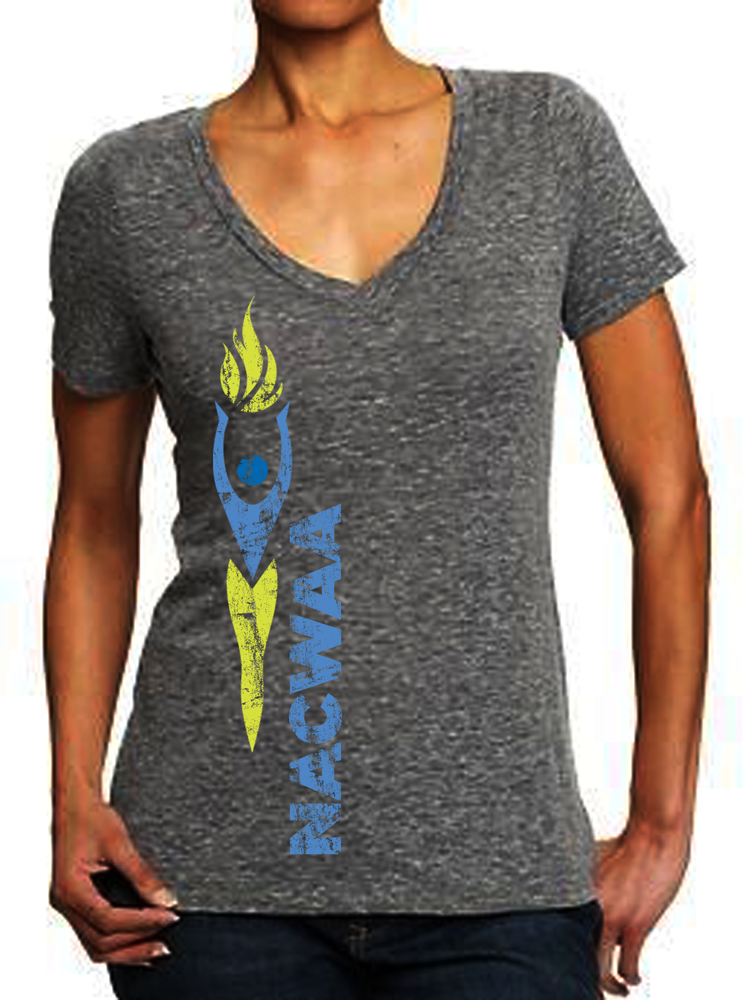
This customer received 21 t-shirt designs from 11 designers. They chose this t-shirt design from VintageDesigner as the winning design.
Join for free Find Design Jobs- Guaranteed
-
 US$140
-
 21 designs
-
 11 designers
T-shirt Design Brief
In total, I need (4) t-shirt designs, but really one main design with the remaining three being slight variations of that main design. Our organization is NACWAA – the National Association of Collegiate Women Athletic Administrators. We are an association for women leaders in sports who want a surge of positive momentum in their professional and personal growth. NACWAA is a powerful, dynamic network of peers and mentors who enthusiastically share their energy and experience to champion women leaders and make a meaningful difference in the world of sports and beyond. Our organization is centered on four words – STRONG, INSPIRED, RESILIENT, and PASSIONATE. I would like a unique t-shirt design for EACH of these words. Each design can be similar, with just slight variations. I want women to put on these shirts and feel inspired, strong, passionate, or resilient. These designs will be printed on women’s, V-neck vintage tees.
Target Market(s)
Professional (but still fun!), athletic, classy and stylish women.
Industry/Entity Type
College
Font styles to use
Other font styles liked:
- Century Gothic
Colors
Colors selected by the customer to be used in the logo design:
Look and feel
Each slider illustrates characteristics of the customer's brand and the style your logo design should communicate.
Elegant
Bold
Playful
Serious
Traditional
Modern
Personable
Professional
Feminine
Masculine
Colorful
Conservative
Economical
Upmarket
Requirements
Must have
- Creative use of the concepts from our logo – the “inspired woman”, the flame, etc., in addition to each actual word weaved into the design.
Nice to have
- Our colors are lime green & royal blue, with grey and light blue secondary colors (style sheet included). The design is about the word and the feeling, and should be conveyed with our brand, colors and image, but I don't want the design focus to be our organization or name. I left the colorful/conservative marker in the middle because I tend to think grayscale, lighter color looks better on vintage tees. I'm open to ideas though!
Should not have
- I would prefer NOT to have our acronym (NACWAA) in the design.