Premium watch retailer in Moscow Needs a Logo design improvement
Want to win a job like this?
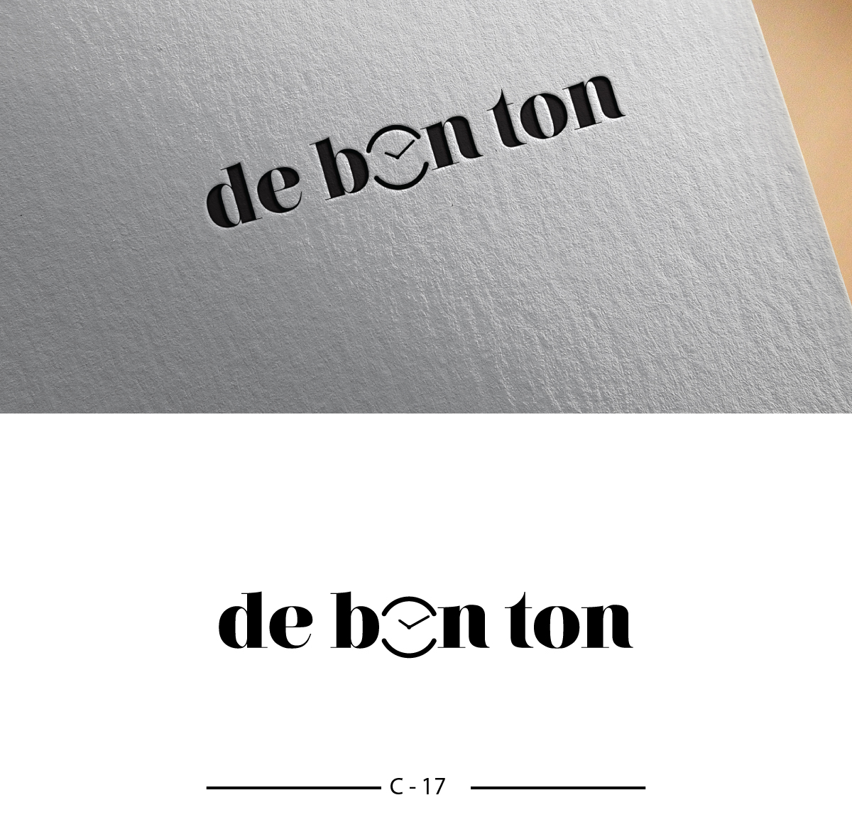
This customer received 217 logo designs from 64 designers. They chose this logo design from Designanddevelopment as the winning design.
Join for free Find Design Jobs- Guaranteed
-
 US$310
-
 217 designs
-
 64 designers
Logo Design Brief
de-bon-ton (www.de-bon-ton.ru) is a 9 shops multi brand watch retailer in Moscow bringing a completely new shop format to Russian capital Moscow: bringing new trendy watch brands from around the world ( First to detect new hot brands from around the world) and great service through specialy trained staff.
de-bon-ton aims to showcase watches as lifestyle accessories.
The name "de bon ton" was inspired by the famous "gazette du bon ton" that ultimately became the magazine Vogue.
The actual logo + signature (cf joint files) CAN NOT be changed as they are used in the retail shops and registered as such. What we need is to add a visual element to this logo to make it recognizable to the client (visual signature such as Nike, Starbucks, apple...). this symbol must show case the disruptive character of the brand and out line the stylish/fashion positioning.
The visual element SHALL NOT have any common direct link to the watch industry (Swiss flag, watches components,…). main colors are dark blue and black . References could be the mosaic construction of the watch in store display or the "gazette du bon ton" , but this is not mandatory.
The winning concept will be a strong and highly recognizable visual elements that client could associate the brand de-bon-ton with.
You will find in a joint file examples of logos that we have proposed to the client: they liked the boldness , but not the direction . They felt it is not safe enough to go into that direction
Target Market(s)
Moscow, Russia.
Industry/Entity Type
Retail
Logo Text
de bon ton
Logo styles of interest
Pictorial/Combination Logo
A real-world object (optional text)
Abstract Logo
Conceptual / symbolic (optional text)
Colors
Colors selected by the customer to be used in the logo design:
Look and feel
Each slider illustrates characteristics of the customer's brand and the style your logo design should communicate.
Elegant
Bold
Playful
Serious
Traditional
Modern
Personable
Professional
Feminine
Masculine
Colorful
Conservative
Economical
Upmarket
Requirements
Must have
- 1) use the dark blue (featured in the shop) and/or black color
- 2) the size of the visual must be reasonable in comparaison to the logo size (not too big / not too small)
- 3) The visual must be strong and easily identifiable
Should not have
- 1) ANY ALTERATION of the existing brand name (font + size) + signature
- 2) any common direct link to the watch industry (Swiss flag, watches components,…)
- 3) The visual anchor CAN NOT be made out the "D" "B" "T" letters (nor any other letters
- 4) The visual anchor can not be an animal