Pilates at Revolution Fitness needs an elegant logo design with a reformer
Want to win a job like this?
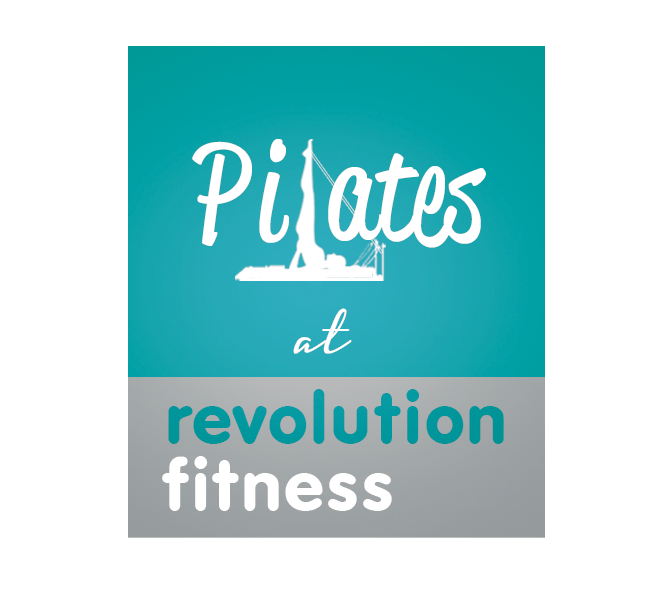
This customer received 105 logo designs from 18 designers. They chose this logo design from Sarah Mathews as the winning design.
Join for free Find Design Jobs- Guaranteed
-
 A$175
A$175
-
 105 designs
-
 18 designers
Logo Design Brief
We need a matching logo for the Pilates side of our Personal Training business. We are a personal training business that opened in 2003. We have been teaching mat Pilates for many years and added Studio Pilates on reformers, trapeze table and wunda chair 2 years ago. We offer small group classes on the equipment and one-on-one sessions. We cater for people with injuries, those wanting to get more mobility, flexibility and strength, athletes and ballet dancers. We offer highly individualized programming - we are not a cookie-cutter Pilates Studio. Both men and women come to us for Pilates. We currently have a logo for the personal training business and we want a similar format with softer colors and a piece of Pilates equipment - preferably the reformer, instead of a dumbbell. This logo will be used on a sign on our building to start, and in the future we will require further designs for business cards, apparel, - shirts and hats - stationery, website and social media etc. We want to make sure the color scheme is complimentary to the existing logo, while being softer. However, it should not look overly "feminine" as men are clients also. The Revolution Fitness logo is attached, and there are examples of a general style/layout of logo for Pilates at Revolution Fitness. Attached are also Pilates exercises on the reformer for your reference.
Updates
Project Deadline Extended Reason: Not enough submissions. Added Tuesday, September 13, 2016
Target Market(s)
Upmarket, but not out of reach financially. Most of our current clients are in the 35-65 age group, mostly professionals.
Industry/Entity Type
Fitness
Logo Text
Pilates at Revolution Fitness
Logo styles of interest
Pictorial/Combination Logo
A real-world object (optional text)
Font styles to use
Look and feel
Each slider illustrates characteristics of the customer's brand and the style your logo design should communicate.
Elegant
Bold
Playful
Serious
Traditional
Modern
Personable
Professional
Feminine
Masculine
Colorful
Conservative
Economical
Upmarket
Requirements
Must have
- Please look at "Revfit Logo" that has been uploaded as this logo MUST follow the layout, dimensions, and font of the Revfit Logo. This must be a combination logo with a symbol and the words. "revolution fitness" needs to be the same font layout and lower case as on the original logo, in a block of colour. The words "Pilates at" should be a flowing or elegant style, and it must have a piece of pilates equipment on it. The top part of the logo needs to have the same dimensions as the original logo in a different colour to the base, but the same colour as the word "revolution". The illustration of the equipment should be a silhouette style with a woman performing a Pilates exercise.
Nice to have
- Perhaps have the word "Pilates" entwined with a piece of pilates equipment - eg. a reformer. But not too flowery.
Should not have
- Not retro or vintage. Not cartoonish. no "clip art". Not too abstract (if at all). The exercise performed on the reformer needs to be achievable - not advanced. ie. no "splits" or "arabesques". No bright pink. If pink is used at all, just small amounts balanced with a more "masculine" colour. But still softer overall than the original "revolution fitness" logo.