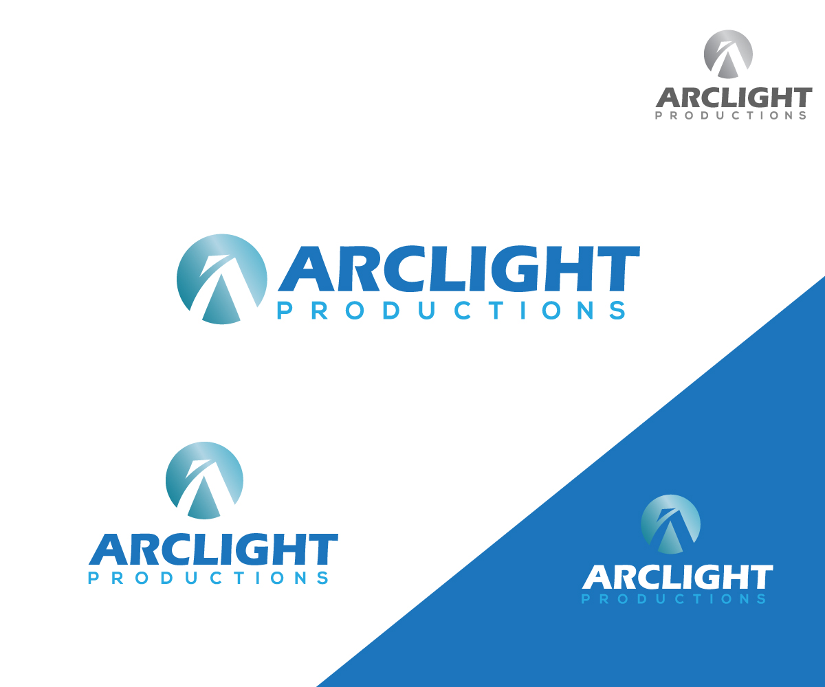
Film production company logo re-design

Want to win a job like this?
This customer received 162 logo designs from 52 designers. They chose this logo design from sonym as the winning design.
Join for free Find Design JobsLogo Design Brief
We want to re-design the logo for our company, Arclight Productions, so that it feels similar to the current logo but is more updated. We particularly think that "Arclight" could be more readable and more refined (fyi: the original font is Eras). In other words, we want to update the logo to appeal to new clients but not be so different that current clients are confused and think it's a different company. Current logo has been uploaded.
Target Market(s)
Business to Business: we make documentaries and other non-fiction content for clients that include movie studios, TV networks, corporate brands, and arts organizations (e.g. museums). Our logo also appears in the main title and end credits of the films that we produce.
Industry/Entity Type
Film Production
Logo Text
Arclight Productions
Logo styles of interest
Abstract Logo
Conceptual / symbolic (optional text)
Wordmark Logo
Word or name based logo (text only)
Font styles to use
Colors
Colors selected by the customer to be used in the logo design:
Look and feel
Each slider illustrates characteristics of the customer's brand and the style your logo design should communicate.
Elegant
Bold
Playful
Serious
Traditional
Modern
Personable
Professional
Feminine
Masculine
Colorful
Conservative
Economical
Upmarket
Requirements
Nice to have
- We currently have a word mark logo, but it would be interesting to see a design that adds an abstract graphic in addition to the text. We would even consider plainer text alongside a great graphic. It would amazing to see a graphic that somehow suggested the idea of light without becoming a literal lightning bolt or Jacob's ladder. For background information, an "arclight" was a type of light source used on movie sets and also to project films in the early days of cinema. It was basically an arc of electricity inside a housing that produced light (before light bulbs were bright enough to do the job).
Should not have
- The word "Productions" should be less prominent than "Arclight." We would also advise against using the letter P in a graphic for the same reason.