Kids book company looking for epic illustration!
Want to win a job like this?
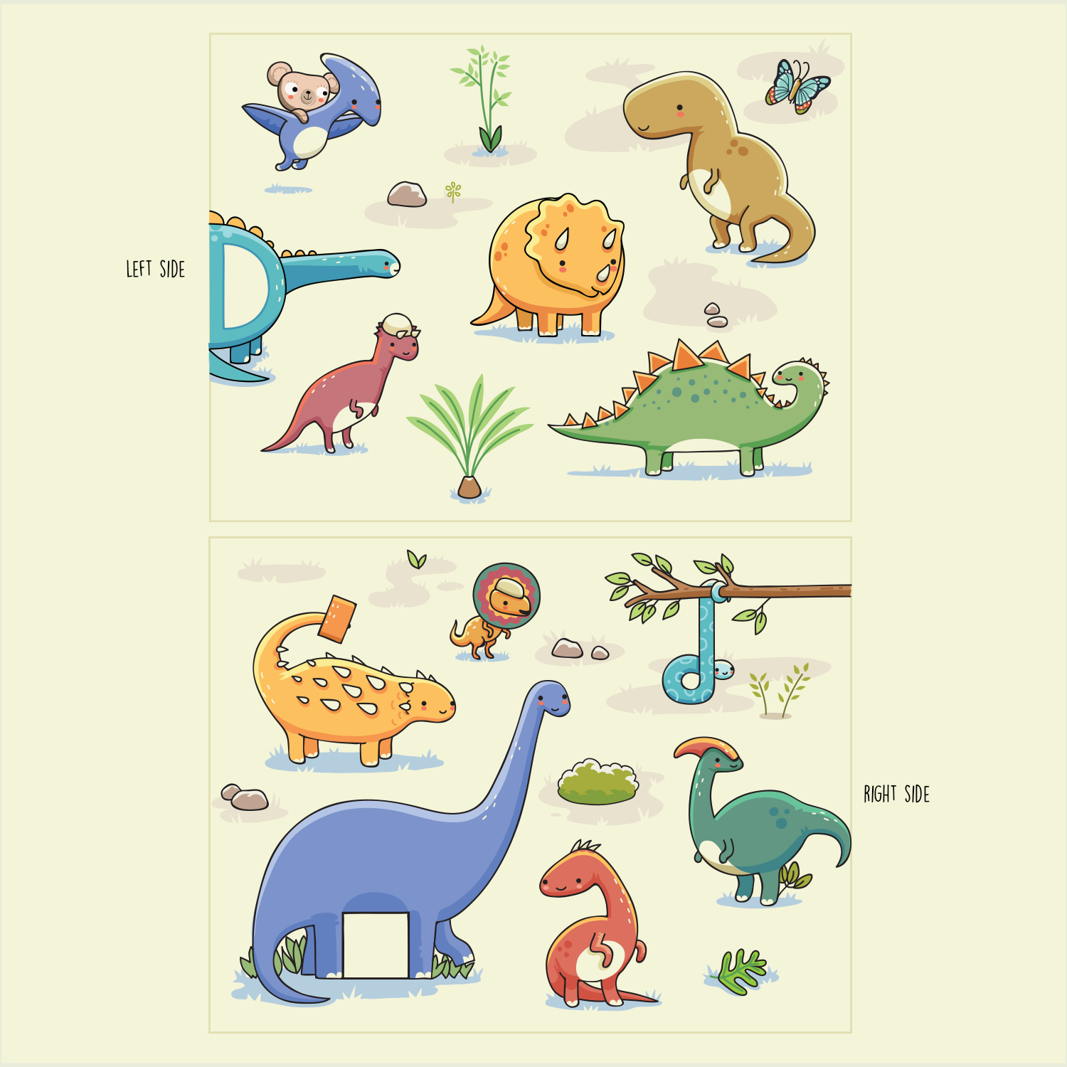
This customer received 37 illustration designs from 19 designers. They chose this illustration design from Frontino graphic studio as the winning design.
Join for free Find Design Jobs- Guaranteed
-
 NZ$140
-
 37 designs
-
 19 designers
Illustration Design Brief
We're testing the crowd-sourcing waters on a new kids book - an alphabet book ( ... think A is for Apple ... ) - conceptually, though, it is going to be global collaboration of illustrators from around the world - with different letters being illustrated by different people - creating a dynamic and unique look!
I've attached a full brief and also the Teddy we're going to include to link each page together (hidden somewhere on your illustration). It's going to be important you read the brief for guidelines.
The style and composition is totally open, however, the winning designs will be well considered, colourful, and eye-poppingly awesome.
This project is for one illustration - to give you some creative legroom that will hopefully allow you to play to your strengths, choose one from the five options below:
1 - D is for Dinosaur - with the letters D d
2 - R is for Robot - the letters R r
3 - A is for Apple - with the letter alternates A a, P p and M m (see brief and this will make much more sense!)
4 - P is for Penguin - with the letters alternates P p and M m
5 - B is for Butterfly - with the letters alternates B b, S s, P p and M m
Target Market(s)
Kids - (and parents) - aged 2-6.
Industry/Entity Type
It Company
Look and feel
Each slider illustrates characteristics of the customer's brand and the style your logo design should communicate.
Elegant
Bold
Playful
Serious
Traditional
Modern
Personable
Professional
Feminine
Masculine
Colorful
Conservative
Economical
Upmarket
Requirements
Must have
- See the brief for full info:
- The style is completely open and totally yours!
- There is a single subject matter per double page spread - i.e. if A is for Apple - then it's all about Apples... Not just one, but enough to make the page interesting.
- The composition is open too - i.e. It could be a branch with apples hanging off, it could be a big bushel of apples, or simply some fabulous isolated apples on the page.
- In order to support counting, the aim is to create multiples of the subject - preferably between 3 and 10. I.e. 8 Apples, or 10 Butterflies. Now.... If that’s literally impossible - one main element and several other directly related elements that can be used for counting is ok - (i.e. one moon and 10 stars!).
- Within the composition - it’s critical to consider the placement of letters - in capital and lower case - i.e. ‘A’ and ‘a’. In some cases, we will need different letters - as separate layers or different files - for instance Apple in French starts with a P.
- There’s also shapes and colours to consider. Shapes are a compulsory include (see over page). Colours - while there’s no set palette or requirement, consider asking a child ‘Point out the red apple’ or ‘Show me the Green Apple’...
- The must-have's are:
- 1. LETTERS
- The capital and lower case letter of the subject matter. Drawn matching your illustration - not as a font. These can be located anywhere within the main illustration. Note : There may be more than one letter due to languages - work these on different, toggle-able layers (or separate art).
- 2. SHAPES
- Somewhere within the illustration, you need to work in: a circle, a triangle, a rectangle and a square.
- This can be part of an illustration - i.e. a the moon is a circle - or it can be simple shapes within or worked into your image. These don't have to be in-your-face obvious, but they want to be identifiable by a 2-6 year old - so don't make them too tough either!
- 3. TEDDY
- As this is a collaborative illustrative effort - there’s going to be one element to tie all the pages together. We’re going to use this teddy.... Please hide him or work him into the image in some way. He can be small, it can be just one eye and an ear that sticks out - but somewhere within your artwork, you’ll need to include the Teddy.
- 4. YOUR SIGNATURE & COUNTRY
- As we’re aiming to make this a collaboration of different illustrators and illustrations from all over the world, and intend this to be something you’re proud of - please sign your work! Somewhere near your signature - include the country you’re from.
Nice to have
- Nice to have a feel of your own style ! Have fun with this - it's designed to be a fun project and communicate that enjoyment of it to the reader. This wants to be work you're seriously proud of.
- Largely ignore the look and feel sliders - it's telling me to fill them in - but TBH - the style is up to you!
Should not have
- Anything that has come from any other stock website. This needs to be your own, original work.
- From message posted - thought I'd pop it in here as well just in case it helps:
- Hey all! Seeing a couple of designs come through looks like I need to clarify a couple of things!
- 1/ The only 'text' I'm looking for are the upper and lower case letters - i.e. A and a. Please leave any other text off as this will be added in later on. This needs to be illustrated and tie in with the artwork - not a font.
- 2/ This is a double page spread of the SAME letter - please work right across the landscape, B5, double page spread.
- 3/ Please ensure that the 'must have's' are in place - circle, square, triangle, rectangle and teddy.
- 4/ You are welcome to re-draw the teddy to match your style. The intent is the teddy would be partially hidden on each spread.