A logo for a hedge fund, which is a financial services investment company.
Want to win a job like this?
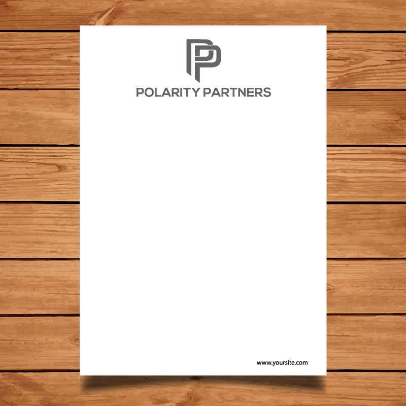
This customer received 62 logo designs from 20 designers. They chose this logo design from Alif studio as the winning design.
Join for free Find Design Jobs- Guaranteed
-
 £120
£120
-
 62 designs
-
 20 designers
Logo Design Brief
Objective
We wish to obtain a logo design for our newly established hedge fund, Polarity Partners. It is a financial services company involving trading financial assets on behalf of investors. Hence, the logo has to convey the serious task that is entrusted to us by investors. The logo should be distinctive and interesting but not excessively flashy or gimmicky. It should also not be overly colourful. Timelessness, consistency and excellence would be emotions we would like to logo to inspire.
Background
Polarity Partners is a macro hedge fund. On behalf of investors, Polarity will invest in foreign exchange and interest rate financial products with the goal of generating high returns for our clients.
Our style is very research intensive. We undertake detailed economic and market analysis to highlight opportunities that the market might not have seen.
Why the name “Polarity Partners”?
We chose the name because the concept of polarity can describe a fundamental force of attraction or opposition. There can also be numerous “poles” that exert influence on a system. This suits the investment style of Polarity Partners. We use detailed economic and market analysis to see if the fundamental, underlying equilibrium within an economy or system has changed and that markets have yet to acknowledge this switch. Over time, the new polarity will exert an increasingly influence on markets and lead to potentially out-sized movements in economies, financial variables and broader markers. One such example would be if a government refused to devalue it’s currency, but the underlying fundamental forces made such an outcome all but inevitable over the medium- to longer-term.
Ideas for the logo
We would ideally like the name Polarity Partners to be part of the logo, but are willing to be flexible if a particularly impressive design without the words were created. The logo itself would ideally contain a reference to how a fundamental force could influence an object, and/or how there are multiple factors driving a trend. Some examples – and I list a large array of possibilities to spark some ideas - could be:
• A variant of the traditional, Yin and Yang entwined image.
• A line converging to/ being attracted to an object.
• A line being bent from its otherwise straight path.
• An image of a heated or flamed orb/ circle (the earth’s rotating core created magnetism that created polarity).
• Some stylized visualisation of magnetic waves.
Target Market(s)
Current and prospective investors, These might be wealthy individuals, insurance companies, pension funds or government entities.
Industry/Entity Type
Finance
Logo Text
Polarity Partners
Logo styles of interest
Pictorial/Combination Logo
A real-world object (optional text)
Colors
Colors selected by the customer to be used in the logo design:
Look and feel
Each slider illustrates characteristics of the customer's brand and the style your logo design should communicate.
Elegant
Bold
Playful
Serious
Traditional
Modern
Personable
Professional
Feminine
Masculine
Colorful
Conservative
Economical
Upmarket
Requirements
Must have
- A Powerful image that provides an insight into our name and the underlying reasons why we chose it: that a fundamental force can exert pressure on an economy or financial market and influence it's path of travel.
Nice to have
- I chose Gray Scale for the colour scheme, but I am flexible and would welcome a differing colour scheme if a designer came up with a really nice and impactful design.
Should not have
- Not too colourful. Not too flashy or fashionable. We are aiming to convey timelessness, consistency and excellence.