Semi-professional basketball team needs an updated logo design
Want to win a job like this?
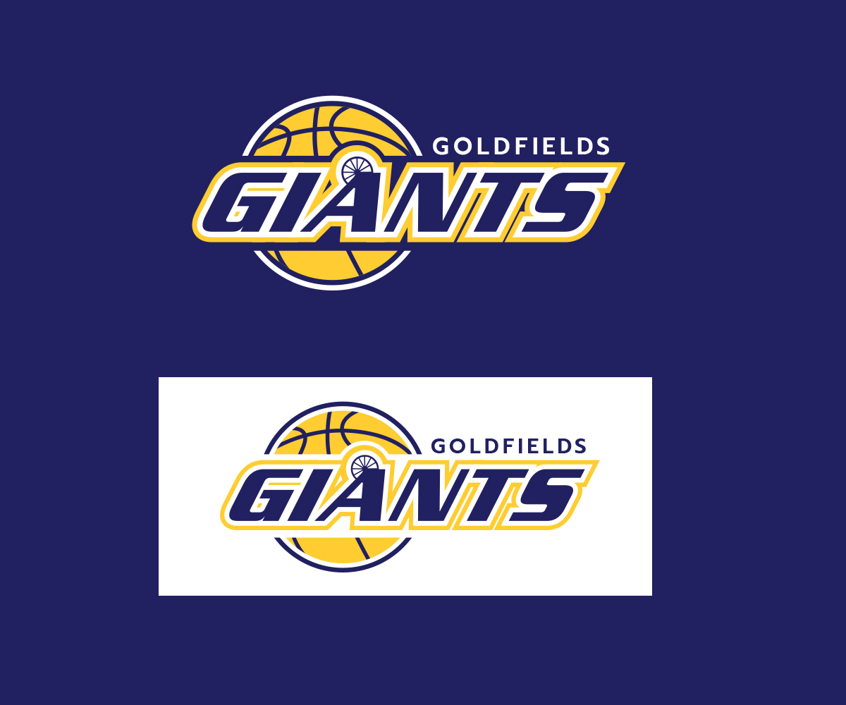
This customer received 83 logo designs from 35 designers. They chose this logo design from JLG Studios as the winning design.
Join for free Find Design Jobs- Guaranteed
-
 A$150
A$150
-
 83 designs
-
 35 designers
Logo Design Brief
We are a semi-professional basketball club and would like either a new logo, or to provide us with an update to one of our old logos. We would like to see different options, feel free to use your creativity to design us a fresh new logo, alternatively help us relive our past and create a design to replicate one of our previous logo's which is very popular with our board and supporters. We have attached a copy of the old logo for your reference. We are based in Kalgoorlie, Western Australia.
Target Market(s)
Basketball and sports fans
Industry/Entity Type
Club
Logo Text
Goldfields Giants
Logo styles of interest
Emblem Logo
Logo enclosed in a shape
Pictorial/Combination Logo
A real-world object (optional text)
Abstract Logo
Conceptual / symbolic (optional text)
Character Logo
Logo with illustration or character
Wordmark Logo
Word or name based logo (text only)
Lettermark Logo
Acronym or letter based logo (text only)
Font styles to use
Look and feel
Each slider illustrates characteristics of the customer's brand and the style your logo design should communicate.
Elegant
Bold
Playful
Serious
Traditional
Modern
Personable
Professional
Feminine
Masculine
Colorful
Conservative
Economical
Upmarket
Requirements
Must have
- Has to have our exact team colours, they are:
- Blue - Hex Code: 000066 RGB: 0,0,102
- Yellow - Hex Code: FFCC33 RGB: 255,204,51
- 'White' can also be used if required.
- It must also have "Goldfields Giants" in the logo, with an emphasis on 'Giants'.
Nice to have
- We would like it to represent our region, we are in a mining town called Kalgoorlie in Australia. We would like some of the options to be a replication of one of our old logo's, which we have attached for reference. We would also like some to be fresh and new, so you can use your own creativity here.
- Note: The "A" on our old logo is designed like a mining headframe, we would like this to be included in the logo (though not a deal breaker) in the same way it has been in our old logo. I have attached photos of an A-Frame so you know what it looks like.
- We have also included our latest logo, which is the one without the headframe.