Logo needed for Organic Farm - Snapping Turtle Farm
Want to win a job like this?
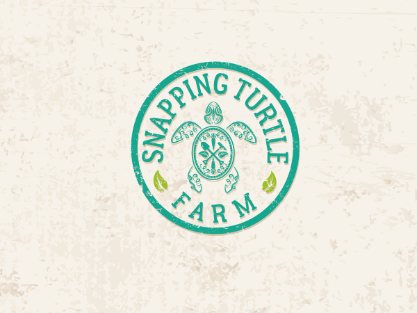
This customer received 178 logo designs from 51 designers. They chose this logo design from Grace A as the winning design.
Join for free Find Design Jobs- Guaranteed
-
 C$270
C$270
-
 178 designs
-
 51 designers
Logo Design Brief
We are a small family owned farm looking to re-brand and expand next year. We have been running under my nutritionist business (www.homegrownhealth.ca) but would like to separate the two businesses. We are a young couple, very active in local agriculture and passionate about supporting local businesses (think hippy, old school, bartering).
We grow mixed crop vegetables. No chemicals, sustainable practices, small hand tools (think barefoot, hoes and rakes, hand picking). I also produce dried herbs, preserves, crackers and sundried tomatoes. I need a logo that can be applied easily to a label for these products.
We like greens and purples (the ones in my current logo) but are open to any colours that aren't muddy yellows/browns/oranges. Please avoid logo designs with "tree of life", or stereotypical "barn/field" items or simply our name with leaves attached.
The end logo should be simple, easily recognizable, 2-3 colours at most but easily convertible to a single colour (black on white background). I like badge/vintage style logos, round. We would like to include a turtle concept in some way.
Please do not include multiple submissions of the same logo in different mockup forms.
What we are really looking for: unique, energetic, warm, inviting, reliable
Update: The logos currently in contention are round badge style logos with stylized turtles in the center.
My husband and I became friends when he found some baby snapping turtles and I offered to give them a home in the swamp at the back of my property. The name is very close to our hearts.
Thank you all for your time and contributions!
Deanna
Updates
I have added some images for inspiration. With the submissions so far, we have been extremely fond of the round badge style logos with some kind of stylized turtle in the center. Purple and green are still the favorite colours. Added Tuesday, December 6, 2016
Hello Designers! We are getting very close to the end of the project and we are very close to choosing a winning design. We wanted to thank you all for your amazing work. We are currently narrowing down our choices and a recurring theme between the designs we like is really standing out. If you would like to submit another design that more closely matches what we are now drawn to, we would love to see what you have to offer!
We love the badge style logos. "Snapping Turtle" across the top half, "Farm" across the bottom. Some kind of leaves to fill the space around the word Farm.
The turtle itself is bold, unique, easily recognizable as a turtle, but abstract at the same time. Slightly more on the feminine side but still bold lines and either a solid teal colour or a mix of greens and purples. Please see the images uploaded in the brief as examples of what we may be looking for.
Thank you all so much and we look forward to selecting a winner!
Added Sunday, December 11, 2016
Target Market(s)
Local agriculture/population, farmers markets, small grocery stores
Industry/Entity Type
Agriculture
Logo Text
Snapping Turtle Farm
Logo styles of interest
Emblem Logo
Logo enclosed in a shape
Pictorial/Combination Logo
A real-world object (optional text)
Font styles to use
Colors
Colors selected by the customer to be used in the logo design:
Look and feel
Each slider illustrates characteristics of the customer's brand and the style your logo design should communicate.
Elegant
Bold
Playful
Serious
Traditional
Modern
Personable
Professional
Feminine
Masculine
Colorful
Conservative
Economical
Upmarket
Requirements
Must have
- Easily readable/recognizable
- Easily convertible to black on white background
- Turtle motif in some way
Nice to have
- Greens / Purple
Should not have
- muddy colours
- cartoony
- barn/field
- "tree of life"
- Industrial/cold feel
- Aggressive angry turtles