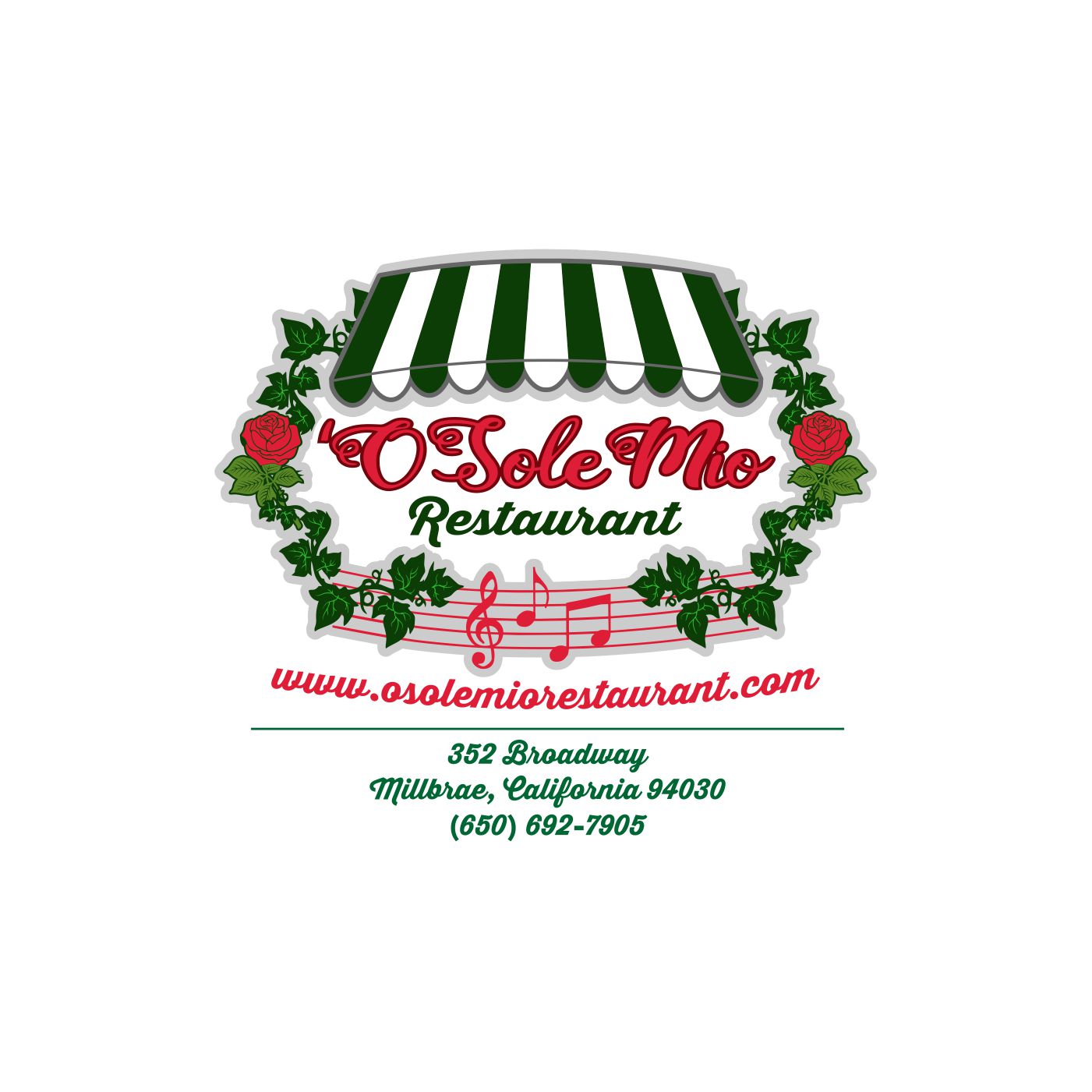
O Sole Mio Restaurant Logo Design
Want to win a job like this?
This customer received 70 logo designs from 20 designers. They chose this logo design from monstersox as the winning design.
Join for free Find Design Jobs-
 US$150
-
 70 designs
-
 20 designers
Logo Design Brief
We need a "Whimsical" Logo Design for our Restaurant. Background- We were in San Francisco from 1954 to 1998, and then move to S.F. Peninsula in 1998 to the Present. Look at the Photo of the Restaurant and the Current Artwork that we use. We want something that incorporates that Style of Lettering we currently use, the Roses, the Vines, and Musical Notes; as we have individual jukeboxes at all the tables playing all the old Rat Pack Songs. Imagine the Rat Pack playing in an Old Style, Red Checked Tablecloth, Italian Restaurant right out of the New York, and you have us !!! Also notice the Green Striped Awning that we have Inside and Outside; Would Somehow like that Element Incorporated in the Logo. Colors should be Maraschino Cherry Red, Forest Green, and White... Thanks.....
Industry/Entity Type
Restaurant
Logo Text
'O Sole Mio Restaurant (Note the apostrophe "after" the O)
Font styles to use
Other font styles liked:
- Similar to Business Card Example, But Open to Similar
Colors
Colors selected by the customer to be used in the logo design:
Look and feel
Each slider illustrates characteristics of the customer's brand and the style your logo design should communicate.
Elegant
Bold
Playful
Serious
Traditional
Modern
Personable
Professional
Feminine
Masculine
Colorful
Conservative
Economical
Upmarket
Requirements
Must have
- Dark Green, Maraschino Cherry Red , White Colors, Vines, Musical Notes
- Type of O Sole Mio Font Included in "Files"!
- "Green and White Striped Awning as Central Focus of Logo"
- Musical Notes Incorporate in Logo
Nice to have
- Vines and Roses look more "Realistic", rather than "Drawn"!