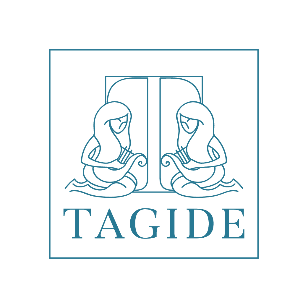
Restaurante Tagide
Want to win a job like this?
This customer received 71 logo designs from 22 designers. They chose this logo design from Irina Makedonska as the winning design.
Join for free Find Design Jobs- Guaranteed
-
 €110
€110
-
 71 designs
-
 22 designers
Logo Design Brief
We need to re style our logo. Tagide means the muses of the river Tagus that our 16th century poet described at the time of portuguese discoveries. Because the restaurant as a fantastic view over the river this name was choosen at the begining of the restaurant 40 years ago. The restaurant as two different concept in the same building; at the first floor is the main restaurant, sophisticated and elegant were you can finf fine dinning food. On the lower floor there is a wine and tapas bar more casual but steel elegant. The inicial colour was bordeaux a few years later we started to use grey. We think the actual logo is old fashion. The name is well known, but the logo no. So we wanted a logo more contemporary that could bring to our times the beautiful meanning of it. Don't Forget the muses.
Target Market(s)
from 35 to 70 years old
Logo Text
the beautifull view, the good food,the unique location. The muses inpire this place. The name cames from an old poem of a great 16th century portugues poet. This poems were inspired on the portuguese discovers of the 16th century.
Look and feel
Each slider illustrates characteristics of the customer's brand and the style your logo design should communicate.
Elegant
Bold
Playful
Serious
Traditional
Modern
Personable
Professional
Feminine
Masculine
Colorful
Conservative
Economical
Upmarket
Requirements
Must have
- muses