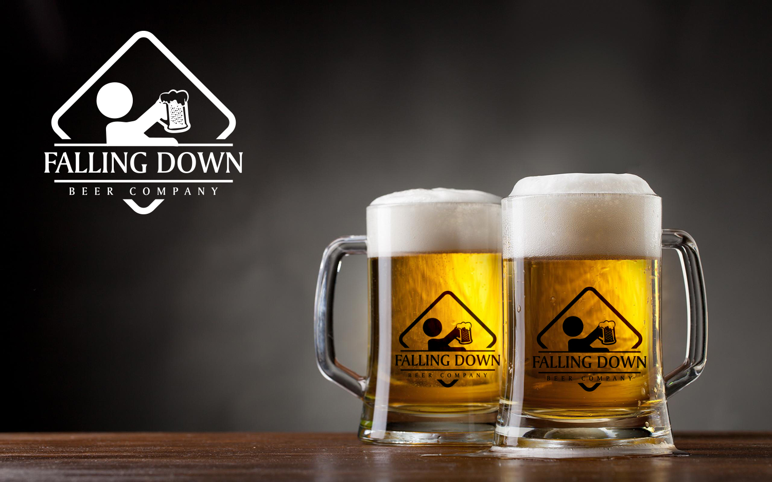
Falling Down logo redesign to make easier for printing and glassware
Winner
Want to win a job like this?
This customer received 81 logo designs from 30 designers. They chose this logo design from IMD-HUB as the winning design.
Join for free Find Design Jobs-
 US$150
-
 81 designs
-
 30 designers
Logo Design Brief
We need to redesign our logo to make is simpler. Logo should use as few colors as possible and be able to transfer easily to glassware, shirts and coaster. The current logo has too many gradients (bad for printing) and isn't bright enough. Would like to keep general "caution sign" feel. Despite our name, you cannot actually show anyone falling down. Attached is old logo or visit our website www.fallingdownbeer.com
Industry/Entity Type
Printing
Logo Text
Falling Down Beer Company
Logo styles of interest
Emblem Logo
Logo enclosed in a shape
Pictorial/Combination Logo
A real-world object (optional text)
Look and feel
Each slider illustrates characteristics of the customer's brand and the style your logo design should communicate.
Elegant
Bold
Playful
Serious
Traditional
Modern
Personable
Professional
Feminine
Masculine
Colorful
Conservative
Economical
Upmarket
Requirements
Must have
- A Pantone standard bright yellow for easy printing
- Caution Sign style
Nice to have
- A black and white version (or easy to make BW) for single color transfers to shirts and glassware
Should not have
- Any depiction of over intoxication
Files
JPG
logo_shield_only_nostalk_400 Tuesday, 07 February 2017 19:18:47
Tuesday, February 7, 2017
Payments
1st place
US$150