How would you improve a drop in a bucket?

Want to win a job like this?
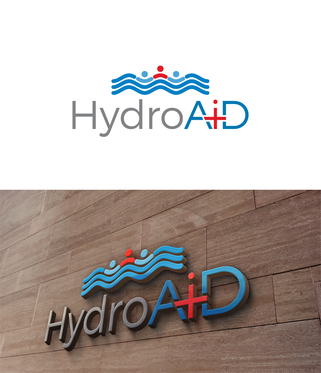
This customer received 156 logo designs from 39 designers. They chose this logo design from trufya as the winning design.
Join for free Find Design Jobs- Guaranteed
Logo Design Brief
Our startup is looking to improve our logo.
Attached is what we got now. It is not bad, but it is not a vector based and was made to satisfy initial need, rather than result of inspiration.
Our company is about to launch an innovative water level control device and provide a cloud based leak detection service.
Logo may be improvement over existing one, or a new concept.
Update 2:
For those seeking further inspiration, I have just acquired a shortcut domain http://pool.plus
I believe that it has a potential of making a good emblem to be used next to the company name. (Hydro AiD)
This should not be treated as a separate logo. I don't wish to see, for example, a lettermark logo "PP" with pool plus underneath.
Plus can be symbolized (So "pool.+" will be acceptable), this is not mandatory.
At this point I wish to retain a symbolic link to the domain, so a dot (.) between pool and plus is encouraged.
I do not wish for an emblem to compete with the company name. Text size on the emblem should be smaller.
Update:
Lettermark logos have unfortunate association with being "HA-ha" funny, we try to avoid such an unfortunate link.
Here are just some of ideas which could be used (individually or in combination):
* Make a cloud around Hydro
* Perhaps A & D could be sails of a ship (with I as a mast in a middle)
* The 'i' could be a light reflecting in the water (such as goo.gl/ygT9qA)
Target Market(s)
Swimming pool owners or businesses with fountains / waterfalls or other water features. People looking for innovative solutions to age old problems.
Industry/Entity Type
Pool Service
Logo Text
Hydro AiD
Logo styles of interest
Pictorial/Combination Logo
A real-world object (optional text)
Abstract Logo
Conceptual / symbolic (optional text)
Character Logo
Logo with illustration or character
Wordmark Logo
Word or name based logo (text only)
Look and feel
Each slider illustrates characteristics of the customer's brand and the style your logo design should communicate.
Elegant
Bold
Playful
Serious
Traditional
Modern
Personable
Professional
Feminine
Masculine
Colorful
Conservative
Economical
Upmarket
Requirements
Must have
- Logo should be vector based and scalable.
- Type font use should be identified and available. Customization (if any) to the font should be documented.
- Logo should use few colors, each color should be separated by layer
Nice to have
- Logo could ideally be configured in tall & narrow (square) shape as well as short & wide (rectangle) shape.
- "Logo" would be an innovative concept / shape which could than be used next to company name / products.
- Logo would be possible to mold in plastic housing (be 3D relief or avoid gradients).
- Logo would work well with product names, such as "Hydro Fill" or "Hydro Fit".
Should not have
- Logo should not be offensive
- Share a strong resemblance to an established brand.