TelferYoung logo refresh - keep colours and modernize
Want to win a job like this?
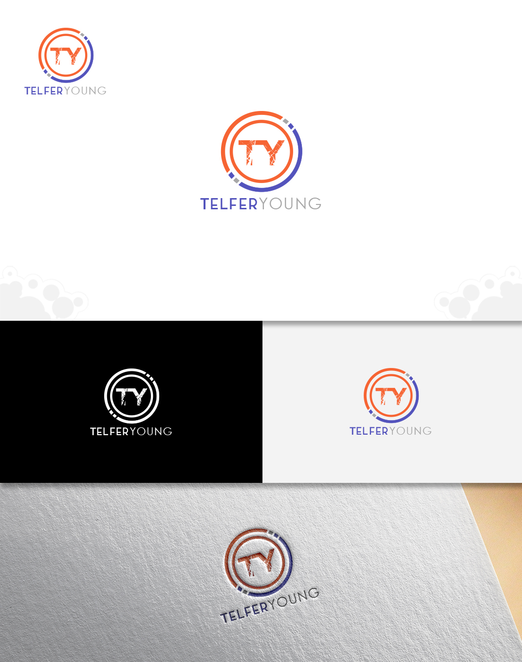
This customer received 172 logo designs from 64 designers. They chose this logo design from web'X'vision as the winning design.
Join for free Find Design Jobs-
 NZ$150
-
 172 designs
-
 64 designers
Logo Design Brief
We would like to refresh our current logo by modernizing it, while retaining the general brand elements such as colours and ++=. Key focus on the colours.
To shorten/compact, possibly using TY instead of TelferYoung (we are open minded here).
Font can change.
We would keep it in tandem with our existing logo, until it is gradually migrated out.
We are property valuers and advisors (this text can be taken out), based all throughout New Zealand. For more information visit https://www.telferyoung.com/
We are a professional services company.
Smaller, shorter, punchy and modernized.
Logo Text
TY or TelferYoung
Colors
Colors selected by the customer to be used in the logo design:
Look and feel
Each slider illustrates characteristics of the customer's brand and the style your logo design should communicate.