Matching Service Needs a Logo Design
Want to win a job like this?
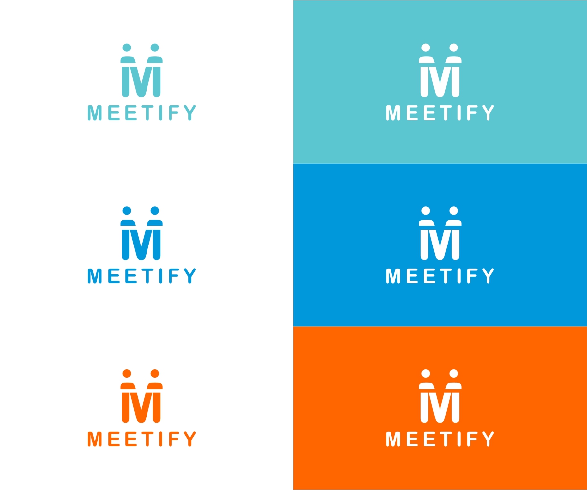
This customer received 185 logo designs from 59 designers. They chose this logo design from Rakesh Mohan as the winning design.
Join for free Find Design Jobs-
 US$150
-
 185 designs
-
 59 designers
Logo Design Brief
We need a logo design for our new matching site based in Tokyo. Our app helps multiple males and females get matched on the platform and guides them to meet in a real restaurant.
We want to make this service to be casually shared like Tinder and talked among friends instead of traditional matching apps which are privately used by a user.
Our target user is male and female between the age of 20 to 25, primarily undergrads and grads. The main focus is a woman who is inexperienced to dating app and a little shy to express their desire to meet the opposite sex. Initial target is aggressive open-minded men and women, but eventually, we want to reach out to the shy and give them excuses like "I use this because my friend set up a meeting with guys and need somebody", assuming they do have the desire to meet deep down in their mind.
Targeted users look for a casual meeting rather than a potential partner.
Target Market(s)
dating, matching industry
Industry/Entity Type
Dating
Logo Text
Meetify
Logo styles of interest
Wordmark Logo
Word or name based logo (text only)
Lettermark Logo
Acronym or letter based logo (text only)
Font styles to use
Look and feel
Each slider illustrates characteristics of the customer's brand and the style your logo design should communicate.
Elegant
Bold
Playful
Serious
Traditional
Modern
Personable
Professional
Feminine
Masculine
Colorful
Conservative
Economical
Upmarket
Requirements
Must have
- ・simple, clean
- ・safeness
Nice to have
- ・users can visually understand that this is an app they use with friends
- ・when my friends somehow open my iPhone, I don't want them to easily notice I have downloaded matching site. I want the design somewhere between not obvious and little obvious.(sorry I don't know how to describe differently)
- Not Obvious → Tinder:https://www.gotinder.com/
- Little Obvious → Pairs:https://www.pairs.lv/
- Very Obvious → https://itunes.apple.com/jp/app/hekonmoranchimogochi!ogorin/id437770354?mt=8
- ・It might be a good idea to take advantage of symmetricity of "M" to implicate man and woman(just idea)
Should not have
- super cuteness
- pink color