Global exploration consultancy needs a capability logo portfolio (no words)
Want to win a job like this?
This customer received 25 logo designs from 6 designers. They chose this logo design from eksaner as the winning design.
Join for free Find Design Jobs-
 A$150
A$150
-
 25 designs
-
 6 designers
Logo Design Brief
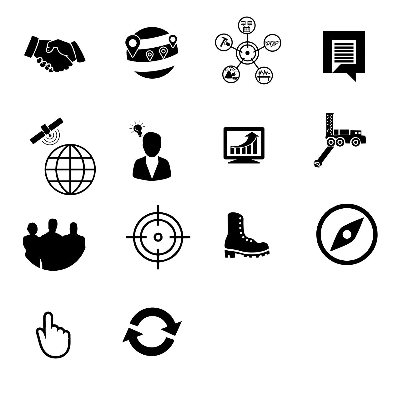
The ultimate challenge. We need 14 icons for a new geoscientific exploration consultancy website in Australia. We follow a process using high-end GIS analysis and conceptual thinking to discover mineral and energy deposits. We are all about partnership with our clients. I now outline the different icons required by explaining our process. No words are needed on the icons.
1. Ore Discovery Partnerships (green dominant). The design should communicate the idea of mutual benefit achieved through combined intelligence and aligned objectives (a bit like 1+1=3). then we move on to 2. Project Generation (blue dominant). this should convey the scale of geological 'belts' or terrains and highlight prospects that could be explored for minerals 3. Integrated Orebody Targeting (yellow-orange dominant) this is about layering data to find a target to drill. 4. Discovery Communication. (orange dominated) This is clear, convincing & certified communications - we make graphics for press releases, company reports and board presentations. 5. Orbital Data & Spectral Geology (orange dominated) - we work with spectra collected from sensors on satellites or from hand held devices. We figure out where the minerals might be. 6. Workforce solutions - we can get boots to log core and we can get professionals in to the office. we're versatile like that. (blue dominated) 7. Breakthrough Technology. We make intelligent exploration tools and build data algorithms. Maybe it's a digital data flow concept. (yellow-orange dominated) 8. Detailed Program Design - Here we are figuring out how deep to drill, what orientation to drill in, what the budget for the program will be. How narrow or wide the borehole will be 9. Is About Us (not sure - grey?) . It should convey a person or a team. 10. Accreditation (yellow-orange dominated) - this is us training people to reach a high standard 11. Contracts & Careers (blue dominated) - this is where people can submit their resume. 12. Case Studies & Success Stories (Green dominated) - this is about how we've helped find resources and solve geological problems. 13. Contact or Book (orange dominated) - click this icon to be transferred to either a contact form or a booking form 14. Page loading icon - prefer the colour wheel be used here Note well - these icons require no words. The file called Icon Example 5 shows the colour scheme proposed. the other files show the orange that will be the dominant header colour above the icons.
Looking forward to your flair and simplicity.
Target Market(s)
CEO and exploration managers looking to find orebodies and promote their discoveries. Mine managers in companies with diminishing resources looking to explore and find more
Industry/Entity Type
Mining
Logo Text
no words on the logos
Logo styles of interest
Pictorial/Combination Logo
A real-world object (optional text)
Abstract Logo
Conceptual / symbolic (optional text)
Colors
Colors selected by the customer to be used in the logo design:
Look and feel
Each slider illustrates characteristics of the customer's brand and the style your logo design should communicate.
Elegant
Bold
Playful
Serious
Traditional
Modern
Personable
Professional
Feminine
Masculine
Colorful
Conservative
Economical
Upmarket
Requirements
Must have
- Icons 1-9 plus 13 & 14 are essential.
- Keep in mind these will be viewed on a mobile phone, between 2 and 4 at a time so simplicity and clarity is important.
- Please provide the icons on a white background.
- Although the icons are on an orange background in the example, in the website they will be on a white background.
Nice to have
- Icons for 10,11 and 12 are nice to have.
- As few elements as possible - simple is what we're after here.
Should not have
- Multiple colours within the same icon. These will be viewed together and more than one colour per icon will be overload.