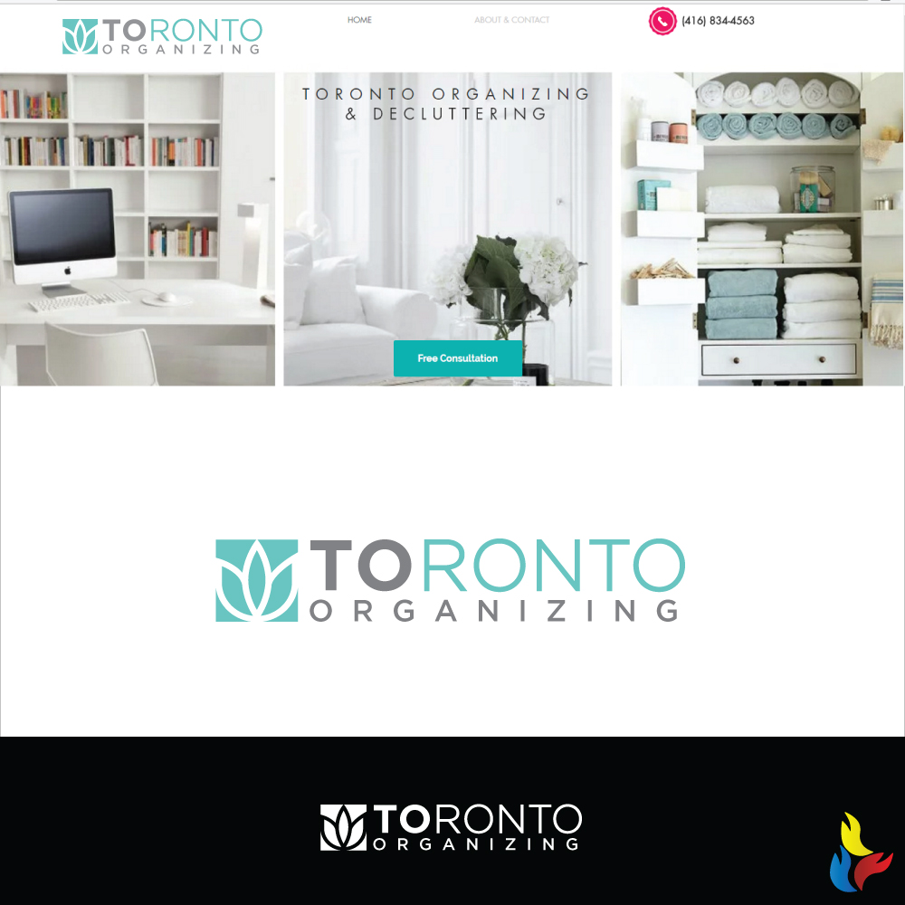
Toronto Organizing Needs a Logo!

Want to win a job like this?
This customer received 122 logo designs from 46 designers. They chose this logo design from Kreative Fingers as the winning design.
Join for free Find Design JobsLogo Design Brief
Who we are: We believe that in order to create the home you want, you must start by eliminating what you don’t want. Whether you want to reclaim your cluttered closets or reorganize your entire home, we’ll help you transform your living spaces and simplify your life, one project at a time.
Conquering clutter and creating living spaces you love will restore your energy, reduce your stress, and clear space for what you truly care about.
All we're missing is a logo! It needs to be clean, simple even minimalist. I alm open to a soft/subtle incorporating of a flower within the logo.
See website for look and feel. www.torontoorganizing.com
Important to emphasis 'TO' for the city of Toronto market.
Target Market(s)
Ages 35 plus. Mostly women. Higher income demographic
Industry/Entity Type
Consultant
Logo Text
Toronto Organizing
Logo styles of interest
Emblem Logo
Logo enclosed in a shape
Pictorial/Combination Logo
A real-world object (optional text)
Wordmark Logo
Word or name based logo (text only)
Lettermark Logo
Acronym or letter based logo (text only)
Font styles to use
Colors
Designer to choose colors to be used in the design.
Look and feel
Each slider illustrates characteristics of the customer's brand and the style your logo design should communicate.
Elegant
Bold
Playful
Serious
Traditional
Modern
Personable
Professional
Feminine
Masculine
Colorful
Conservative
Economical
Upmarket
Requirements
Must have
- Logo design that can be used on current website and for business cards. Website is www.torontoorganizing.com
Nice to have
- T.O. is also shortform for the city of Toronto. Emphasis on TO would be nice to have.
Should not have
- Anything too busy or cluttered. Don't want the logo to be. Infused with promoting the city of Toronto