Spinning & Dance Fitness Convention
Want to win a job like this?
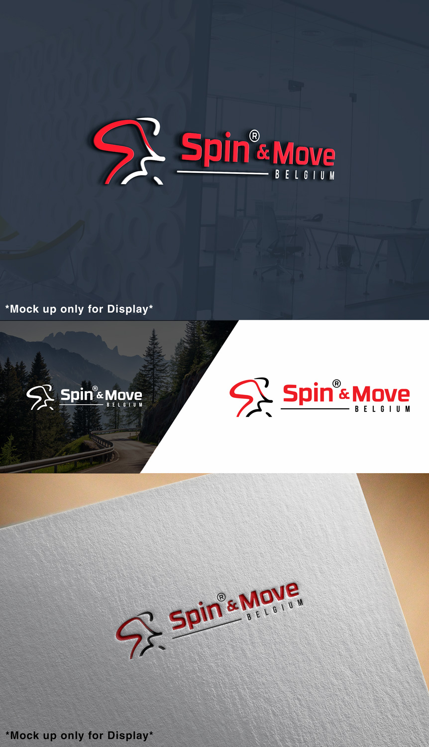
This customer received 114 logo designs from 31 designers. They chose this logo design from srinup9492 as the winning design.
Join for free Find Design Jobs-
 €110
€110
-
 114 designs
-
 31 designers
Logo Design Brief
We are organizing our first edition of the "Spin® & Move" conference in Belgium, we would like to have a great logo that we will use for each new edition, that we will also use in every marketing material and goodies. It needs to represent our concept, the word "Spin®" is a registered trademark for Spinning®, we are receiving the authorization to use it as it is an official event, move is for dance classes like Zumba.
Target Market(s)
Fitness instructors and fans of Spinning and dance classes
Industry/Entity Type
Fitness
Logo Text
"Spin® & Move"
Logo styles of interest
Emblem Logo
Logo enclosed in a shape
Abstract Logo
Conceptual / symbolic (optional text)
Wordmark Logo
Word or name based logo (text only)
Lettermark Logo
Acronym or letter based logo (text only)
Font styles to use
Other font styles liked:
- RBNo.3.1
Colors
Designer to choose colors to be used in the design.
Look and feel
Each slider illustrates characteristics of the customer's brand and the style your logo design should communicate.
Elegant
Bold
Playful
Serious
Traditional
Modern
Personable
Professional
Feminine
Masculine
Colorful
Conservative
Economical
Upmarket
Requirements
Must have
- The word Spin must have the ® of registered trademark.
- Could be nice to have the belgium flag colors somewhere.
- Spinning brand guidelines can be found here https://en1.spinning.com/legal-trademark/
Nice to have
- Could use just the Letters S&M in combination with the full words "Spin® & Move" or just "Spin® & Move"
- Variation with and without Belgium
- You could also use the Spinman logo attached but this logo cannot be transformed, it has to be used as it is, we will use this spinman logo anyway in marketing materials