Restaurant Postcard for Direct Mail
Want to win a job like this?
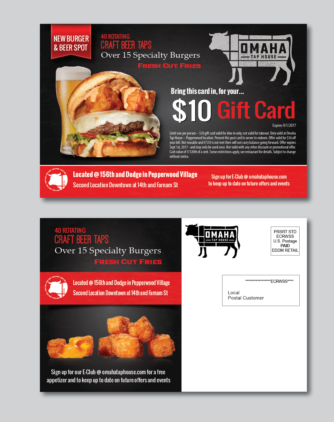
This customer received 19 postcard designs from 6 designers. They chose this postcard design from alex989 as the winning design.
Join for free Find Design Jobs-
 US$140
-
 19 designs
-
 6 designers
Postcard Design Brief
We are looking to send out a direct mail campaign to introduce our new restaurant to the households that are nearby. We would like to highlight our restaurant and the fact that we have food (as with our name "Tap House" people tend to think we are just a bar) and want to include a $10 Off Coupon as well. Postcard size would be an oversized post card that is 8.5" by 5.5" - just need the design file, we will print on our end.
I have attached a few photos to use - also, let me know if there are any other photos you think you might need or want to complete the postcard. Note that the postcard does need to have a space for a rectangle that says "Local Postal Customer" in it (as the mailing address for the consumer) and a space in the upper right hand corner for a postage box. I have added these to the attached word doc so you can add in to the design. Please use either the mac and cheese burger or cheese curd burger in your design.
Other things to consider/include:
- Something about introducing/asking them to try the New Burger and Beer Spot near them
- Location - "Located @ 156th and Dodge in Pepperwood Village" (also should call out second location which is "Downtown at 14th and Farnam St")
As a welcome gift - $10 off coupon - details on offer and small print needed in word doc attached. Put dotted lines around $10 off coupon callout. Small print can live below the coupon cut out section.
Call out 40 Rotating Craft Beer Taps, Over 15 Specialty Burgers, Fresh Cut Fries
Callout to Sign up for E-Club @ omahataphouse.com to keep up to date on future offers and events
I have attached another content reference for more details on style and brand we are looking for - it is for another restaurant of ours but follows our brand guidelines for this restaurant as well. It is called "MBC Scratch Off". For Omaha Tap House though we like to use more Red, Black and Grey vs. the Oranges, Blues, and Yellow you see in that design.
Please let me know if you have questions, happy to help answer anything up front to avoid re-work - thanks!
Kevin
Industry/Entity Type
Restaurant
Look and feel
Each slider illustrates characteristics of the customer's brand and the style your logo design should communicate.